
WCAG contrast ratios: passing AA and AAA on real color pairs
· 6 min read
WCAG contrast ratio guide: AA and AAA thresholds, luminance math, measured color pairs, why 83.9% of home pages fail low contrast, and how to fix them.
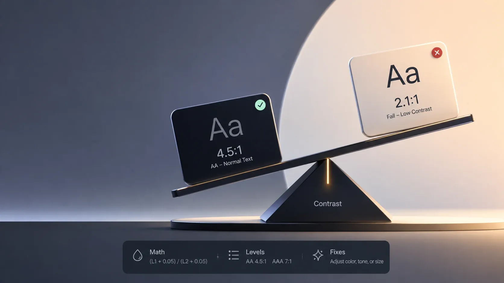
- WCAG AA requires 4.5:1 contrast for normal text and 3:1 for large text
- AAA raises the bar to 7:1 for normal text and 4.5:1 for large text
- Buttons, icons, and form borders need 3:1 as non-text contrast
- Low contrast remains the web's most common accessibility failure
What a contrast ratio actually measures
A WCAG contrast ratio compares the brightness of two colors after converting them into a perceptual scale called relative luminance. The result runs from 1:1, where foreground and background are identical and text vanishes, up to 21:1, which is pure black on pure white. The WCAG contrast minimum guidance defines the thresholds every accessibility audit uses, and the numbers apply to text, icons, form borders, and focus indicators alike.
The scale surprises people because it is not linear. A mid-gray on white lands near 4:1 even though it looks reasonably visible to a designer with good eyesight. The ratio exists to model degraded vision, bright sunlight on a phone screen, and cheap displays, not to judge taste. That is why the thresholds feel strict: they encode the worst common conditions, not the average ones.
The thresholds that matter
| Content | AA minimum | AAA minimum |
|---|---|---|
| Normal text (under 18pt, or under 14pt bold) | 4.5:1 | 7:1 |
| Large text (18pt+, or 14pt+ bold) | 3:1 | 4.5:1 |
| UI components and meaningful graphics (AA-level criterion) | 3:1 | 3:1 |
The AAA contrast requirements exist for audiences with significant vision loss, and most teams treat them as a stretch goal for body copy rather than a hard gate. Non-text contrast, covered by WCAG success criterion 1.4.11, catches a different blind spot: a light-gray border on a white input field can render the field invisible to a low-vision user even when every text inside it passes.
The math behind the number
Three steps produce the ratio. First, each sRGB channel is linearized: values near black get divided by 12.92, and everything else passes through a gamma curve. Second, the linear channels combine with fixed weights: green contributes 71.52% of luminance, red 21.26%, and blue 7.22%, which is why green-tinted grays read lighter than blue-tinted ones at the same hex value. Third, the lighter luminance plus 0.05 divides by the darker luminance plus 0.05, producing the final ratio. The MDN color contrast guide walks through the same calculation with worked code.
Running that formula during this research produced the measurements below, so the table reflects the actual WCAG definition rather than rounded marketing numbers.
Real color pairs, measured
| Pair | Ratio | AA normal text |
|---|---|---|
| #000000 on #FFFFFF | 21.00:1 | Pass |
| #767676 on #FFFFFF | 4.54:1 | Pass, by 0.04 |
| #777777 on #FFFFFF | 4.48:1 | Fail, by 0.02 |
| #3B82F6 on #FFFFFF | 3.68:1 | Fail; passes large text |
| #FF0000 on #FFFFFF | 4.00:1 | Fail |
| #FFFFFF on #008000 | 5.14:1 | Pass |
Two rows deserve a second look. The Tailwind-style blue at #3B82F6, one of the most copied button colors on the web, misses normal-text AA by a wide margin even though white text on it looks crisp. Pure red on white fails too, which startles teams who assumed any saturated color reads as high contrast. Neither color is unusable: the blue passes the large-text bar, and both can be darkened a step to clear 4.5:1.
The one-shade failure
The gray pair in the table is the sharpest lesson in this guide. #767676 on white passes AA at 4.54:1. One shade lighter, #777777, fails at 4.48:1, and the two grays are visually indistinguishable. Design systems routinely standardize on a #777 or #888 secondary-text gray because it looks safe, and the audit then flags every instance. The boundary is unforgiving by design, so treat 4.5:1 as a floor with margin: aim near 5:1 for body copy and the borderline cases stop mattering.
What WCAG does not require
The standards carve out sensible exceptions. Logotypes and brand names carry no contrast requirement, decorative images need none, and disabled form controls are exempt because users cannot interact with them. Incidental text in photographs and text that is pure decoration also fall outside the rules. The full WCAG 2.2 specification lists each exception with its rationale. Exemption is not endorsement, though: a low-contrast logo is legal yet still harder for many users to perceive, so treat the exemptions as a floor, never a target. Decorative images also owe their own decision once contrast stops applying, which our alt text guide covers from the accessibility side.
Fixing a failing pair
Direction matters when adjusting colors. Lightening the lighter color usually buys more ratio than darkening the darker one, because luminance follows a curve where the bright end moves fastest. A practical sequence: measure the pair, move the lighter color one step lighter, remeasure, and stop once the ratio clears the threshold with margin rather than by hundredths. Swapping which color sits on top counts too; white text on that failing blue is the same 3.68:1 as the blue on white.
The scale of the industry problem makes the habit worth building. The 2026 WebAIM Million report detected low contrast text on 83.9% of the one million home pages analyzed, up from 79.1% the year before, making it the single most common accessibility failure found. The same survey has shown this pattern for years now, which means most teams are shipping the same mistake. One audit blind spot deserves its own check: text sitting over photographs, gradients, or dark-mode surfaces can pass against one region of the background and fail against another, so measure the worst-case pixel area behind the glyphs, not an average.
A testing workflow that sticks
- Check body text, links, placeholders, and button labels against their real backgrounds
- Check hover, focus, and active states, since state colors change the pairing
- Check form borders and icon strokes at the 3:1 non-text bar
- Record the passing pairs in the design system so fixes stay fixed
The color contrast checker measures any foreground and background pair instantly, including the AA and AAA verdicts for each text size, which makes it the fastest way to clear a page before an audit does it for you. For the standards themselves, the W3C's WCAG overview maps every success criterion, and the contrast minimum definition spells out the exact formula auditors apply.
One horizon note keeps this guide current: the draft WCAG 3.0 standard proposes replacing raw ratios with the APCA model, which weighs perceptual contrast differently and will eventually change the numbers, not the habit of measuring.
Contrast as routine hygiene
Checking each WCAG contrast ratio rewards teams precisely because it is cheap: a ratio takes seconds to measure, fixes are one-step color changes, and the failure rate across the web means doing this at all puts a site ahead of most. Measure the pairs, keep a margin above the thresholds, and record the winners. The contrast checker turns the whole routine into a habit that survives redesigns.
Written by
Abhay Khant
Abhay Khant is the founder of ToolSura, a privacy-first developer tools platform. Writes about client-side architecture, AI tooling, and the open web.