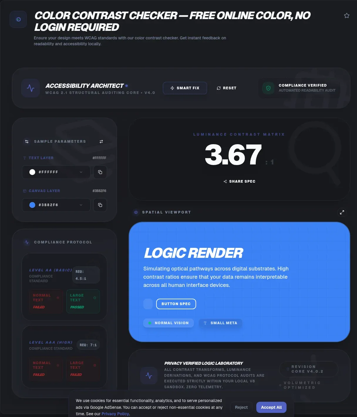
A color contrast checker measures the brightness difference between two colors and reports it as a ratio, telling you whether real users can actually read your text. The ToolSura version runs entirely in your browser. Low-contrast text remains the single most common accessibility failure on the web: it appeared on 83.9% of the one million home pages WebAIM crawled in February 2026 (WebAIM Million).
Nothing is uploaded when you use it. The comparison happens in client-side JavaScript, so your palette never leaves your device, and there is no server call, no account, and no stored history. That privacy model matters when you are checking unreleased designs or client work covered by an NDA. This guide covers the exact thresholds, the luminance math behind every score, the exemptions people get wrong, and the legal picture as of August 2026.
Key Takeaways
- WCAG AA needs 4.5:1 for normal text, 3:1 for large text, and 3:1 for meaningful graphics.
- AAA raises those targets to 7:1 for normal text and 4.5:1 for large text.
- Raw values decide pass or fail, so 4.49:1 fails with no rounding.
- ToolSura's checker runs client-side, so your colors stay on your machine.
- 83.9% of home pages WebAIM audited in February 2026 had low-contrast text.
What Is a Color Contrast Checker and Why Does One Matter?
A contrast checker converts two colors into relative luminance values and reduces them to a ratio between 1:1 (identical colors) and 21:1 (black on white) (WebAIM). The number answers one question: can a reader distinguish your text from its background? People with low vision, anyone working in bright sunlight, and users on dim or cheap screens all depend on that margin.
The governing rules sit in WCAG 2.2, whose current edition is the W3C Recommendation dated December 12, 2024 (W3C). Success Criterion 1.4.3 sets minimum text contrast, 1.4.6 sets enhanced contrast, and 1.4.11 covers non-text elements. A good checker automates all three comparisons in one place.
What Contrast Ratio Do You Need for WCAG AA?
Level AA requires a contrast ratio of at least 4.5:1 for normal text and 3:1 for large text under Success Criterion 1.4.3 (W3C). Icons, input borders, and UI component states follow a separate 3:1 rule under Success Criterion 1.4.11 (W3C).
Chasing Level AAA raises the targets to 7:1 for normal text and 4.5:1 for large text. The W3C explains that 7:1 corresponds to the needs of readers with visual acuity around 20/80 (W3C). AAA stays optional for most teams, though some government and enterprise style guides demand it.
Reading the ladder at a glance:
- 1:1 means both colors are identical, so text vanishes.
- 3:1 clears AA for large text and for non-text elements.
- 4.5:1 clears AA for body copy and AAA for large text.
- 7:1 clears AAA everywhere.
- 21:1 is black on white, the highest possible score.
What Counts as Large Text Under WCAG?
Large text means at least 18 points (24 pixels) in regular weight, or at least 14 points bold, which works out to about 18.66 pixels (W3C; corroborated on WebAIM). Bigger glyphs carry more inherent visibility, so they qualify for the easier 3:1 AA threshold.
Three details trip people up. First, the measurement uses the delivered font size, not the size after user zoom. Second, bold only shifts the boundary at 14 points; bold text smaller than that still needs the full 4.5:1. Third, thin font weights earn no discount, so a hairline 20px headline should still be tested as normal text. Headings usually clear the bar. Captions, timestamps, and placeholder text almost never do.
How Is the Contrast Ratio Calculated?
Every color first collapses into a single relative luminance value through the sRGB formula L = 0.2126R + 0.7152G + 0.0722B. Each channel passes through a gamma curve specified in the W3C definition (W3C wcag repo). Green dominates because human eyes respond to it most strongly, which is why yellow-green pairings swing the ratio far more than navy ones.
The ratio itself is (L1 + 0.05) / (L2 + 0.05), where L1 is the lighter color and L2 the darker, as defined in the WCAG 2.2 glossary (W3C). Swapping foreground and background leaves the result unchanged, so paste order never matters (WebAIM). Transparency complicates things: semi-transparent text lets the background bleed through, so a half-opacity white over black behaves nothing like solid gray.
Why Does a 4.49:1 Result Fail When It Looks Fine?
WCAG compares raw computed values and permits no rounding at the threshold. A ratio of 4.49:1 sits below 4.5:1 and fails, however harmless it looks on screen. WebAIM's explainer demonstrates the trap with #777777 gray on white, which computes to roughly 4.47:1 and misses the mark despite looking comfortably readable (WebAIM).
The fix takes seconds: darken the text a touch, lighten the surface, or nudge the green channel, then recheck. Lightness moves the number quickly because the formula responds continuously. Many teams adopt an internal floor near 4.7:1 so that anti-aliasing, compression, or a late theme tweak never pushes production text underneath the official line.
Which Elements Follow the 3:1 Non-Text Rule?
Success Criterion 1.4.11 extends contrast past text: visual information required to identify UI components, and graphical objects required to understand content, need at least 3:1 against adjacent colors (W3C). Input borders, icon strokes, checkbox outlines, chart lines, and focus indicators all fall here.
Exemptions cover inactive controls, appearances inherited from default browser styling, and graphics classed as essential, a bucket that includes photographs, flags, logos, and heat maps. Decoration stays outside the rule too, though heavy shadows can soften a button's perceived edge and make its true border harder to judge. The safe habit is to test the functional boundary at 3:1 and let ornament remain ornament.
Which Text Is Exempt From Contrast Requirements?
Two carve-outs exist. Incidental text carries no requirement when it is inactive, purely decorative, invisible to all users, or part of a picture containing significant other visual content. Logotypes are exempt outright: text that forms part of a logo or brand name has no contrast requirement (W3C).
An exemption is not an endorsement. A washed-out watermark may pass while still hiding information from low-vision readers, and a faint wordmark quietly loses recall with older shoppers. Treat the exceptions as room for creative elements, not permission for unreadable supporting copy. Form field placeholders receive no special treatment: if users must read them, 4.5:1 applies.
How Do You Check Contrast Over Gradients and Photos?
Sample the worst region and test that pair. WCAG defines no automatic method for variable backgrounds, so the accepted workflow is manual: find the lowest-contrast area of the gradient or photo behind your text, take that pixel's color, and run the combination through a checker, exactly the approach WebAIM advises (WebAIM).
Interactive states deserve their own round, because a background that shifts on hover or animation can silently drop below threshold; Accessible Web flags this limitation directly on its checker page (Accessible Web). A disciplined routine helps: generate the gradient, capture the stop colors at both ends and the midpoint, and confirm every likely text position clears 4.5:1. Photographs need several sampled spots, since a bright window or pale sky can sit anywhere in the frame.
Is WCAG Contrast Legally Required for Your Website?
It depends on who you are. Across the European Union, the European Accessibility Act, Directive (EU) 2019/882, has applied since June 28, 2025 to defined product and service categories. They include e-commerce, consumer banking, telecoms, transport services and their websites, e-books, and devices such as smartphones and payment terminals (EUR-Lex). Microenterprises providing services with fewer than 10 staff are exempt, and enforcement happens nationally (Your Europe).
In the United States, the DOJ's ADA Title II rule adopts WCAG 2.1 Level A and AA as the technical standard for the web content of state and local government entities. An interim final rule effective April 2026 then extended the compliance deadlines. Public entities serving 50,000 or more people must comply beginning April 26, 2027; smaller entities and special district governments begin April 26, 2028 (Cornell LII; ADA.gov). Obligations for private businesses under ADA Title III remain case-by-case and unsettled. This overview is general information, not legal advice.
What Is Happening With APCA and WCAG 3.0?
WCAG 3.0 is not ready, and designing to it today would be premature. The newest edition is the W3C Working Draft dated March 3, 2026, flagged by the W3C itself as inappropriate to cite as anything other than a work in progress, with several years of work remaining (W3C).
APCA, the perceptual model frequently floated as the successor to contrast ratios, is not an adopted standard either. It persists as a research question in the open W3C issue w3c/wcag3#158, which has tracked its evaluation as a possible method since January 2025 (W3C GitHub). The pragmatic play: meet WCAG 2.x ratios for anything compliance-related right now, and file any APCA readings under experimental insight, clearly separated from pass/fail reporting.
Why Did Low-Contrast Text Rise Again in 2026?
After six years of steady improvement, the curve turned. The WebAIM Million, 2026 edition, drawn from February 2026 crawls of the top 1,000,000 home pages, detected low-contrast text on 83.9% of home pages, up from 79.1% in 2025, returning it to the top of the failure list (WebAIM Million).
The average home page carried 34 distinct low-contrast instances, a 15% jump year over year. Two caveats keep the numbers honest. Automated scanning only catches what scripts can see, so true prevalence runs higher, and the sample covers home pages rather than entire sites. Neither weakens the takeaway for shipping teams: contrast defects are the fastest accessibility mistake to make and the cheapest to catch before launch.
How Does ToolSura's Checker Compare With Other Tools?
On features, the well-known checkers overlap heavily. WebAIM's offers lightness sliders, an eyedropper, sample sentence previews, permalinks, and optional JSON output (WebAIM). Accessible Web publishes a results table spanning SC 1.4.3, 1.4.6, and 1.4.11. Adobe Color checks against WCAG 2.1 with color-blindness previews but documents no large-text sizing options. Deque University's analyzer evaluates uploaded images for text-in-image cases yet documents no manual hex entry fields.
Data handling is where those pages go quiet: none of the four documents where checking happens, so their processing location is not documented on their page, and Deque's site cookie notice concerns analytics rather than color processing. ToolSura states its model openly: the entire calculation runs client-side in the browser.
Ecosystem demand keeps growing. The npm package wcag-contrast logged 126,877 downloads in the week of 2026-08-16 to 2026-08-22, while color-contrast logged 13,626 in the same week, both registry snapshots rather than averages (npm Registry API; npm Registry API). The numbers show how routinely developers bake contrast math into build pipelines.
How Do You Use a Color Contrast Checker Step by Step?
- Enter your text color as the foreground.
- Enter the surface color behind it as the background.
- Read the ratio and match it against 4.5:1 for body sizes or 3:1 for large text and UI boundaries.
- On a failure, adjust lightness before hue, favoring green-channel tweaks since that channel carries the most luminance weight.
- Recheck hover, focus, visited, and disabled variants, because each creates a fresh color pair.
- Save passing pairs into your design tokens so nobody reintroduces the failure next sprint.
Remember what a passing ratio proves: that one pair clears one criterion. Site-level conformance weighs every success criterion together, so a notebook full of passing pairs supports the work but never replaces a full audit.
Five Habits That Keep Your Palette Accessible
- Encode thresholds in design tokens, setting 4.5:1 expectations for text roles and 3:1 for borders and icons.
- Keep a buffer above the line, aiming near 5:1 so ordinary drift never dips below compliance.
- Test states, not just defaults, covering hover, focus, active, and visited pairs separately.
- Distrust transparency, because any alpha below 100% blends with the backdrop and drags the measured ratio down.
- Re-run checks after every rebrand, the moment old approvals most often turn into silent failures.
Related Tools
Contrast validation slots into a wider color workflow, and the surrounding steps have dedicated tools:
- Generate and refine candidates with the color picker and palette generator.
- Preview blends with the CSS gradient generator, then test the extreme stops.
- Switch notation mid-calculation with the HEX to RGB color converter.
- Weigh decorative edges against the 3:1 boundary rule with the CSS box shadow generator.
- Harvest real-world tones with the image color palette extractor and verify text over each swatch.
- Tune animated transitions with the hex code animator so mid-animation frames stay above threshold.
- Color Blindness Simulator — check how a palette reads without relying on hue
Whenever a pairing looks ready, run it through the color contrast checker and confirm the ratio before it ships.