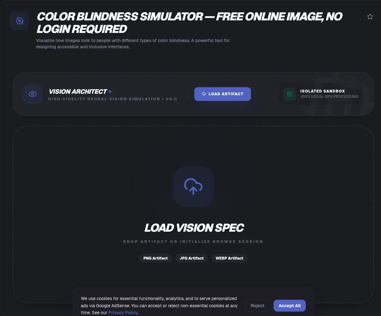
Roughly one man in twelve reads your interface through a different set of cones than you do. Red-green color vision deficiency affects about 8% of men, which quietly turns status dots, chart legends, and error messages into guesswork for part of your audience (National Eye Institute). ToolSura's Color Blindness Simulator shows you their version of your design in seconds, entirely in your browser.
Nothing is uploaded anywhere. Your image never leaves your device: pixels are processed locally with JavaScript and canvas, with no uploads, no accounts, and no server storage at any point. Drop in a mockup, toggle each deficiency type, and see the design the way a chunk of your real audience already does.
Key Takeaways
- About 1 in 12 men has red-green color vision deficiency, roughly 8% of male viewers (National Eye Institute)
- ToolSura simulates protanopia, deuteranopia, tritanopia, and achromatopsia with zero uploads
- Serious simulators run on peer-reviewed models: Brettel 1997 and Machado 2009, whose matrices power Chrome DevTools
- WCAG forbids color-only signaling (SC 1.4.1) and sets 4.5:1 as the text contrast floor
- Simulation checks distinguishability; a contrast checker checks readability, so use both
How Common Is Color Blindness?
Far more common than most product roadmaps admit. Around 8% of men and about 1 in 200 women live with red-green color vision deficiency (MedlinePlus Genetics), and roughly 300 million people are colorblind worldwide (Colour Blind Awareness). Scale that up: a page with 100,000 monthly sessions carries thousands of readers seeing shifted hues.
The type mix matters for testing priorities. Deuteranomaly, reduced sensitivity to green, is the most common form at about 5% of males (Webvision). Full dichromacy is rarer: deuteranopia near 1.5% of men, protanopia near 1%. Design against deutan and protan confusion first and you have covered almost everyone affected.
Why Does Color Blindness Hit Men Sixteen Times Harder?
Genetics, specifically the X chromosome. Red-green deficiencies are X-linked recessive: the opsin genes (OPN1LW and OPN1MW) sit on the X chromosome, so men, carrying a single X, need only one mutated copy, while women usually need both copies affected (MedlinePlus Genetics). That one chromosome explains the gap between 8% and 0.5%.
There is a quirky footnote: fathers cannot pass red-green deficiency to sons, who inherit a Y chromosome instead. Daughters can carry it silently. For product teams the takeaway is blunt: audiences skewed male, think gaming, trading platforms, and developer tools, run hotter than the headline average suggests.
Which Four Types Does the Simulator Cover?
Four: protanopia, deuteranopia, tritanopia, and achromatopsia. They span everything from deuteranopia at roughly 1.5% of men down to achromatopsia at about 1 in 30,000 people (Webvision; GeneReviews). The first two break red-green discrimination and cover nearly every case you will meet.
Protanopia vs Deuteranopia: What Actually Differs?
Both are red-green deficiencies, but they fail differently. Protanopia silences the long-wavelength red cone, so reds darken dramatically and sink into surrounding greens. Deuteranopia silences the medium-wavelength green cone, so greens drift beige and merge with similarly light reds (Webvision). Same confusion axis, different brightness behavior, which is exactly why you test both modes.
Tritanopia and Achromatopsia: Rare but Real
Tritanopia touches an estimated 0.008% of people, a blue-yellow confusion so uncommon most teams never hear from an affected user (Webvision). Complete achromatopsia affects roughly 1 in 30,000 people (GeneReviews). Rare is not ignorable: achromatopsia mode doubles as a grayscale legibility check that catches low-contrast trouble for every user.
How Does Color Blindness Simulation Actually Work?
Not a sepia filter slapped over your pixels. The foundation is peer-reviewed vision science. Brettel, Vienot, and Mollon published the modern method in 1997: project every visible color onto the reduced plane a dichromat can still perceive, anchor the projection to invariant hues, and validate the matches against real protanope and deuteranope observers (Journal of the Optical Society of America A). Real eyes signed off on the math.
Vienot, Brettel, and Mollon simplified the approach in 1999 into replacement colourmaps designers could apply directly to displays. Machado, Oliveira, and Fernandes extended the science in 2009 with a physiologically based model handling normal, anomalous, and complete color vision through one 3x3 matrix multiplication per pixel (IEEE Transactions on Visualization and Computer Graphics). Those matrices are precisely what powers vision emulation in Chrome DevTools (Chrome for Developers).
What a Simulator Can and Cannot Tell You
Whether information survives, not what one specific person sees. An independent review found the Brettel and Vienot methods the most accurate available once adapted to sRGB displays, while warning that every simulation remains an approximation (DaltonLens). Individual variation, severity differences, and monitor calibration all inject error.
Remember the demographics: most people with color deficiency are anomalous trichromats whose color world is shifted and dulled, not a dimension short. Treat simulation as a fast, repeatable stress test that catches outright failures early. For high-stakes interfaces, add a few colorblind testers and watch where comprehension actually breaks.
How Do You Test an Image for Colorblind Accessibility?
Drop the file in, cycle the four modes, and repair whatever disappears. Processing stays local, so you can iterate on confidential, unpublished mockups instantly. The working sequence:
- Export the design. Save your screen, poster, chart, or logo as PNG, JPG, or WebP. Full-page screenshots work fine.
- Drop it onto the simulator. Parsing begins immediately; nothing travels to a server.
- Check deuteranopia first. Highest-volume case. Watch status colors, chart series, and button states for collapse.
- Repeat with protanopia. Reds go dark here; graph lines vanish against dark backgrounds.
- Scan tritanopia and achromatopsia. Blue-purple pairs and overall grayscale legibility surface in these modes.
- Fix, then re-test. Separate failing colors by lightness, add labels, icons, or patterns, and rerun until every mode reads cleanly.
Shortcut worth adopting: extract the palette from your image first with the Image Color Palette Extractor, audit six swatches instead of one complex composition, then apply the fixed palette back.
What Does WCAG Actually Require for Color?
Three concrete things: never convey meaning by color alone, hold 4.5:1 text contrast, and keep essential graphics at 3:1. Success Criterion 1.4.1, Use of Color, sits at Level A: color may not be the only visual means of conveying information, indicating action, or distinguishing elements (W3C). Flagging required fields or errors in red alone is a formally documented failure, technique F81 (W3C).
The Contrast Numbers That Matter
Criterion 1.4.3 sets normal text at 4.5:1 and large text at 3:1; a 4.49:1 ratio technically fails (W3C). Criterion 1.4.11 extends the 3:1 floor to UI components and graphical objects needed to understand the page (W3C). Colorblind users meet these thresholds twice over, because contrast must survive after hue shifts scramble apparent lightness. Google's web.dev guidance walks through how color and contrast choices compound for low-vision readers (web.dev).
Simulator vs Contrast Checker: Why You Need Both
Different instruments, different failures. A simulator asks: when hue collapses, can these colors still be told apart? A contrast checker asks: is this text readable against its background? A design can pass either test and flunk the other. Simulate here first, then measure exact ratios with the WCAG color contrast checker before anything ships.
Lightness is the bridge between the two tools. Luminance differences survive every type of color blindness, which is why contrast-driven fixes and simulation passes reinforce each other. Build separation with lightness first, decorate with hue second, and both instruments start agreeing.
Which Design Patterns Survive Every Type of Color Blindness?
Redundant encoding, always. Every color-coded signal needs a second channel: an icon, a text label, a pattern fill, or a fixed position. That single habit satisfies SC 1.4.1 and protects users whose exact simulation nobody can predict. The patterns below hold up across all four modes.
Error States Beyond Red
Red error text is fragile twice over: it fails SC 1.4.1 when used alone, and protanopia darkens red into a murky olive blending with nearby grays. Pair every error with an icon, a written message, and a border or background change. Move the meaning from hue to shape and wording, then confirm the fix in the simulator.
Charts, Dashboards, and Gradients
Multi-series charts fail fastest under simulation. Use colorblind-safe categorical palettes, vary marker shapes and line styles, and label lines directly instead of leaning on a hue-keyed legend. Gradients deserve special suspicion: two hues that blend smoothly in normal vision can flatten into one band once a cone type drops out, so test gradient endpoints in every mode. Category-colored visuals like word clouds need the same scrutiny.
Why Choose a Browser-Based Simulator Over Installed Apps?
Friction and trust. Sim Daltonism requires installing a native macOS or iOS app. Stark counts hundreds of thousands of installs in Figma yet gates deeper checks behind accounts and paid tiers. Chrome DevTools emulation runs only on desktop Chrome and accepts no arbitrary image file. A browser tool opens on any operating system, needs no install, and handles any image you throw at it.
Client-side processing adds a quieter benefit: confidentiality. Unreleased brand work, NDA material, medical or legal imagery never touches a third-party server, because no server exists in the loop. The honest trade-off: a tab cannot filter your whole live display the way a native overlay app can. For image assets and screenshots, the browser wins cleanly.
When Color Vision Decides Careers and Commerce
More often than design discourse admits. Since January 2025, applicants who fail all approved FAA color vision tests are limited to day-only VFR flying (FAA). NFPA 1582 lists monochromatic vision as a Category A disqualifier for US firefighters. Electrical work, rail operations, and laboratory science screen for color vision too.
Commerce stacks on top. UK retailers lose an estimated 17.1 billion pounds a year as disabled shoppers abandon inaccessible sites, with 69% clicking away immediately (Click-Away Pound Survey, 2019). Low-contrast text appears on 79.1% of the top million home pages, and 94.8% of tested home pages carried detected WCAG failures (WebAIM Million). Accessible color is revenue, not decoration.
Does This Tool Upload My Images?
No, and you can verify it in ten seconds. ToolSura decodes and recolors every pixel with canvas code inside your own tab. Open your browser's network inspector during a simulation and watch: no request ever carries your image data. Confidential work stays confidential by architecture.
No upload path also means no metered queue and no artificial file-size ceiling; your device's memory is the only limit. Once the page loads, it keeps working even offline. Privacy here is structural, not a clause buried in a terms document.
What Are the Most Common Checking Mistakes?
Five failures show up repeatedly, and each takes seconds to prevent:
- Testing only deuteranopia. Protanopia darkens reds in ways deuteranopia never shows. Cycle all four modes.
- Judging thumbnails only. Hue collapse hides at small sizes. Inspect critical regions at full resolution.
- Fixing hue with more hue. Separation must come from lightness, labels, and pattern, or it fails the next mode down.
- Ignoring embedded text. Text baked into images still needs contrast. Simulate, then measure with a contrast checker.
- Treating simulation as certification. It is a stress test, not proof. Combine it with contrast math and real user feedback.
Related Tools
The simulator slots into a wider color workflow, and every one of these runs in the browser alongside it:
- Color Contrast Checker: pair simulation with exact WCAG ratio measurements for text, buttons, and icons.
- Image Color Palette Extractor: pull the dominant colors out of any reference image, then audit that palette in isolation.
- Color Picker & Palette Generator: rebuild failing palettes with deliberate lightness steps that survive every mode.
- CSS Gradient Generator: construct gradients, then bring the export back here to test endpoint collapse.
- HEX to RGB Converter: translate corrected values into whichever format your design tokens demand.
- Word Cloud Generator: build category-colored word clouds, then verify their categories read apart in every simulation.
One man in twelve is not a rounding error; it is a seat at every meeting you join. Run your key screens through all four modes, give every color-coded signal a second channel, and hold your contrast ratios. ToolSura keeps the entire audit on your machine. Drop in a screenshot now and see what your design looks like to everyone else in the room.