
Deciding between CSS gradients and background images
· 5 min read
CSS gradient vs background image decided with measurements: the same visual at 40 bytes versus thousands, when each wins, and the hybrid patterns pros ship.
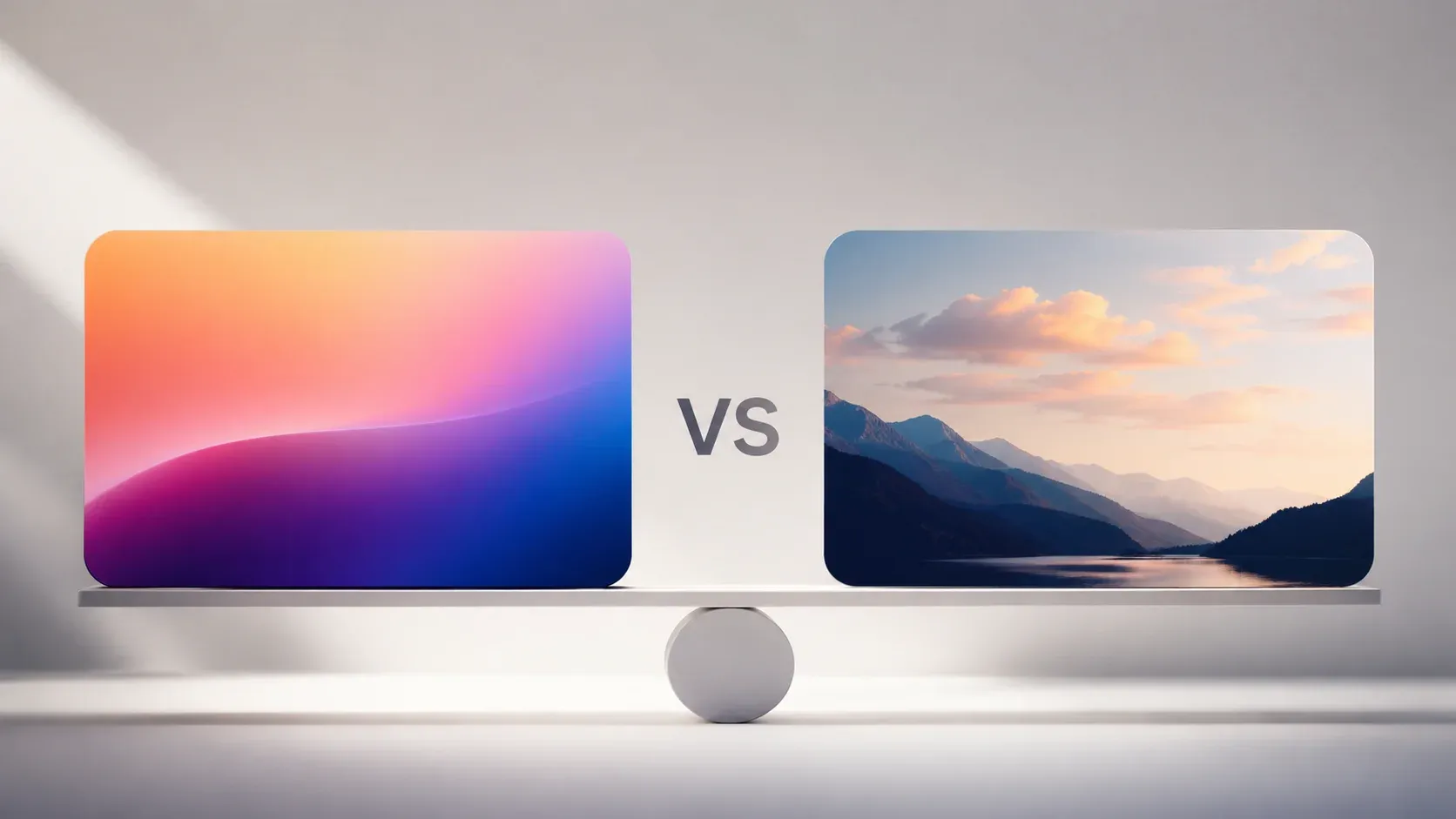
- Same gradient, measured: CSS costs 40 bytes; the best image format cost a hundred times more
- Gradients scale to any resolution with zero requests and no blur from resizing
- Images win for photographic texture, complex art, and anything gradients cannot express
- Hybrids pair gradient backgrounds with image overlays for depth at low weight
The question behind the question
CSS gradient versus background image sounds like syntax preference, but it is really a decision about what your background is: a mathematical color ramp or a picture. Gradients are functions computed by the browser, defined by the CSS Images specification as images in their own right. That status makes them usable anywhere a url() would go, including every background layer. Raster backgrounds are fixed-pixel photographs of intent. Choosing correctly saves bytes, requests, and redesign pain.
To make the tradeoff concrete instead of rhetorical, we rendered one identical 1600x900 linear gradient, blue #3B82F6 fading into purple #8B5CF6, as CSS and as raster files encoded with cwebp 1.5.0 (quality 80) and ImageMagick (JPEG quality 80), then measured:
| Encoding | Size | Versus CSS |
|---|---|---|
CSS: linear-gradient(90deg, #3B82F6, #8B5CF6) | 40 bytes | 1x |
| WebP quality 80 | 3,984 bytes | 100x |
| PNG (lossless) | 6,505 bytes | 163x |
| JPEG quality 80 | 13,929 bytes | 348x |
Our WebP versus PNG breakdown and compression guide explain where these numbers come from. The JPEG result surprises people: photographic compression hates smooth ramps because every subtle step becomes visible block noise, so it spends bytes failing to look smooth, a mismatch documented in the JPEG format overview. Even WebP's excellent modern coder needed a hundred times the CSS budget for identical pixels. The same physics causes gradient banding, the stepped rings that show up when a smooth ramp passes through a lossy encoder or an economical display panel.
Where CSS gradients win outright
- Resolution independence: a gradient renders perfectly on any display density; raster files need responsive variants or accept blur
- Zero network requests: the declaration ships with your stylesheet, removing latency entirely
- Instant recoloring: theme switches adjust two hex values rather than commissioning new artwork
- Animation: positions and colors tween smoothly with CSS alone, and the MDN gradient guide catalogs linear, radial, and conic variants, the conic form reaching all major engines around 2020 per MDN's conic reference
- No resampling artifacts: browsers recompute ramps at native resolution instead of stretching exported pixels
Where background images win
Gradients describe ramps; they cannot hold content. The moment a background needs photographic realism, product atmosphere, illustration, noise texture, or recognizable subject matter, an image becomes required. Complex brand artwork with overlapping transparencies, grain, and light effects exceeds what reasonable gradient stacks express, and hand-drawing it in CSS produces unmaintainable novelty code. The gradient function set makes the boundary explicit: functions describe ramps, nothing more. A well-encoded WebP photograph often weighs less than you would expect, while rebuilding it from layered gradients trades a few saved kilobytes for unmaintainable code.
One more practical point favors images in specific niches: print-style textures and subtle paper grain rely on randomness gradients approximate poorly, and accessibility-conscious designs sometimes prefer textured separation that survives grayscale viewing, where hue-only ramps vanish.
The hybrid pattern most sites actually ship
Production frontends rarely choose exclusively, and layered backgrounds are the standard mechanism for mixing both. A darkening gradient over a hero photograph guarantees text contrast regardless of the photo beneath, a technique our contrast guide quantifies with WCAG thresholds. Duotone effects stack a photo under two semi-transparent gradients for branded looks at photographic richness. And gradient placeholders behind lazily-loaded images keep layouts feeling fast while bytes arrive. The background-image syntax documents stacking multiple layers comma-separated, which is the mechanism all three patterns use.
.hero {
  background-image:
    linear-gradient(rgba(0, 0, 0, 0.55), rgba(0, 0, 0, 0.55)),
    url("hero.jpg");
}
Performance notes worth knowing
- Gradients rasterize cheaply and composite on the GPU, though web.dev's rendering guide details why huge animated ones can still cost frames, so animate opacity or transform where possible
- Background images should ship sized to their largest rendered slot, in modern formats; our image optimization pillar covers encoding choices
- Above-the-fold gradient backgrounds add negligible render-blocking weight, while images compete with critical rendering unless preloaded deliberately
- Images cache independently of the stylesheet, so repeat visits reuse bytes across pages, while gradients ride inside the CSS bundle, the trade-off MDN's caching guide explains
- Complex multi-stop art belongs in SVG when vector shapes suffice; see our SVG optimization walkthrough for measured wins
Deciding between a CSS gradient and a background image
| Need | Choose |
|---|---|
| Color wash, fade, duotone overlay | CSS gradient |
| Photograph or illustration | Image, optimized format |
| Text legibility over media | Gradient scrim atop image |
| Loading placeholder shimmer | CSS gradient animation |
Dial in exact stops visually with the CSS gradient generator, whose output matches the current specification grammar directly, then paste production-ready declarations straight into stylesheets.
Math beats pixels when math suffices
CSS gradient versus background image resolves to a single test: is your background a function or a picture? Functions compute for free, scale forever, and recolor instantly, and our measurements showed even elite modern codecs paying a hundred times the price to fake one. Pictures carry what functions cannot. Ship gradients wherever the answer is arithmetic, images where meaning demands photography, and stack them together when design wants both.

Written by
Simone Rossi
My framing is that colour decisions on a page are made against a background, and most contrast tools get used against white when the background is not white. Contrast is defined on relative luminance, and the formula has a gamma correction in the middle that is easy to omit and produces wrong answers at every step. The result is a ratio, and the accessibility thresholds are defined on that ratio. I show the calculation rather than a number appearing from nowhere.
Large text and small text have different thresholds, and the distinction is based on the rendered size and weight rather than on the nominal font size. That is worth stating because a heading at the same nominal size as body text passes for a reason the author did not choose. Colour models each solve a different problem. RGB with gamma correction matches a screen.
HSL is convenient for choosing hue and lightness but is not perceptually even, which is why equally light colours differ so much in contrast. HSLuv exists to fix that and is worth knowing about. Gradients need a contrast check at both ends and in the middle, because a gradient that passes at its extremes can fail where the two ends meet.
Palette generation is a starting point rather than an answer. I cover what a generated palette guarantees about spacing between hues and what it does not, which is perceptual difference. Finally, colour is not an accessibility topic on its own. A pair of colours can pass every ratio and still be indistinguishable to a reader with a colour vision deficiency, which is a different test with a different method, and passing one says nothing about the other.