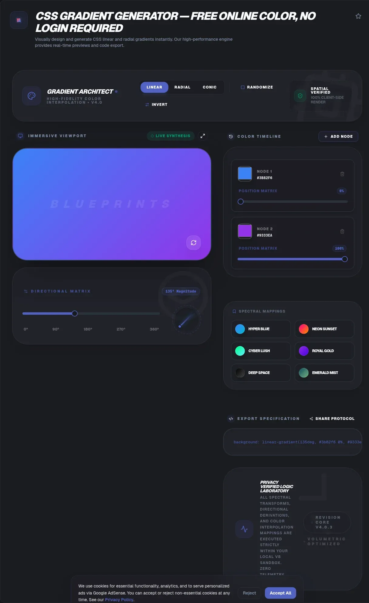
The ToolSura CSS gradient generator builds production-ready linear, radial, and conic gradient code visually, and it runs entirely in your browser. You pick colors, drag stops, set the angle, and copy the CSS. Nothing you create is ever sent to a server: no upload, no account, no tracking of your palette. Every calculation happens client-side on your own device.
That privacy model matters more than it sounds. Because the tool is client-side, your color choices, brand values, and unreleased design work never leave your device. You get instant previews with no network round-trips, and the generator keeps working even offline. This page explains what CSS gradients are, how the three types differ, and how to turn any idea into copy-paste code in about a minute.
Key Takeaways
- The ToolSura CSS gradient generator runs client-side in your browser, so your colors never leave your device and there is no upload.
- CSS gradients are browser-generated images that scale cleanly and ship zero image files (MDN).
- Three functions cover almost every case:
linear-gradient(),radial-gradient(), andconic-gradient().- Color stops set where each color lands, while direction or shape sets how the fade travels.
What Is a CSS Gradient?
A CSS gradient is a smooth color transition the browser computes and paints, not a bitmap you supply. It belongs to the <image> data type, which is why it works anywhere an image works: background-image, border-image, and mask-image all accept one. MDN's gradient reference lists every function and where each is valid.
The idea predates CSS. A color gradient, also called a color ramp, is a progression that interpolates between defined colors across a spatial range. CSS made that concept a first-class value type, standardized in the CSS Images Module Level 4, which defines how gradients are declared, positioned, and interpolated.
Every gradient shares two ingredients: a set of color stops and a rule for how color travels between them. A color stop pairs a color with a position, and the browser fills the pixels in between. Change the stops and you change the palette. Change the travel rule and you change the shape. A css gradient generator gives you a visual handle on both, and exposes each control without asking you to type a line.
The Three Gradient Types
CSS ships three gradient functions, and picking the right one is mostly a question of shape. Linear runs along a straight axis, radial spreads from a center, and conic sweeps around a center by angle. The CSS Images Module Level 4 defines all three, plus the repeating variants that tile a gradient into stripes.
| Function | Shape of transition | Best for |
|---|---|---|
linear-gradient() |
Straight line along an axis | Backgrounds, buttons, overlays |
radial-gradient() |
Outward from a center point | Spotlights, glows, vignettes |
conic-gradient() |
Rotational sweep around a center | Pie charts, color wheels, spinners |
Linear Gradients
A linear gradient blends colors along a straight line. You set a direction, an angle like 45deg or a keyword like to right, then list the color stops. background: linear-gradient(to right, #ff7e5f, #feb47b) fades orange to peach across the box. MDN's linear-gradient page documents the direction keywords and angle units. It is the workhorse type, and the complete linear gradient guide covers multi-stop stripes and the repeating variant.
Radial Gradients
A radial gradient spreads outward from a center point in a circle or ellipse. background: radial-gradient(circle, #fff, #000) fades white at the center to black at the edges. You control the shape, size, and center position, which makes it the choice for spotlights and vignettes. MDN's radial-gradient reference details the sizing keywords, and the radial gradient guide breaks down circle versus ellipse.
Conic Gradients
A conic gradient rotates colors around a center point, so the transition sweeps by angle instead of distance. That single difference makes it the tool for pie charts, color wheels, and loading spinners. MDN's conic-gradient documentation shows the angle and position syntax, and the conic gradient guide builds a working pie chart from scratch.
How Do You Use the CSS Gradient Generator?
The ToolSura css gradient generator turns gradient syntax into a point-and-click task, and every step previews live in your browser. Pick a type, place your colors, tune the geometry, then copy the result. The whole loop takes under a minute, and nothing you build is uploaded anywhere.
- Choose your gradient type. Select linear, radial, or conic. The interface swaps its controls to match, showing an angle dial for linear and shape options for radial.
- Add color stops on the slider. Click the gradient slider to drop a new stop, then assign each one a color with the picker or by typing hex, RGB, or HSL values. Drag stops to reposition them.
- Set the angle or shape. For linear gradients, set an angle such as
45degor a keyword liketo right. For radial and conic, set the shape and center position. - Adjust opacity and alpha. Lower a stop's alpha channel to fade toward transparent. The built-in hex-to-RGBA control writes the
rgba()value for you, which is how you build overlays that let a background show through. - Copy the CSS. When the preview looks right, click copy. The generator writes production-ready code to your clipboard, ready to paste into a stylesheet.
You never memorize syntax or refresh a browser tab to check your work. For a deeper walkthrough of every gradient type, the complete guide to CSS gradients is the hub that ties the individual spokes together.
How Does the CSS Gradient Generator Build Your CSS?
The generator assembles one background or background-image declaration from the type, direction, and every color stop you place. Behind the visual controls, it writes the same syntax defined in the CSS Images Module Level 4: a function name, a direction or shape, and a comma-separated stop list.
Read a gradient as 'axis plus milestones' and the output becomes legible. In a linear gradient, the angle sets the axis and each stop is a milestone along it. linear-gradient(135deg, #6366f1 0%, #ec4899 100%) paints an indigo-to-pink diagonal, and adding #8b5cf6 50% routes the fade through violet at the midpoint. Every gradient grows from that pattern.
Color stops carry an optional position in percentages or pixels. A stop at 20% sits a fifth of the way along the line, while 40px sits a fixed distance from the start regardless of element size. Percentages flex with the box; pixels stay put. The generator lets you drag either, then writes the exact value, so you watch structure and syntax update together.
Two stops at the same position produce a hard edge instead of a fade. That trick, linear-gradient(to right, #000 50%, #fff 50%), splits a box cleanly in half and is the basis for stripes and color bands. The tool exposes it by letting you stack two stops on one point, with no manual math required.
Common Gradient Mistakes to Avoid
Most broken gradients trace back to a handful of syntax slips, and the generator sidesteps every one. A gradient is not a color, so background-color will not render it. Gradients are <image> values, which means they belong in background, background-image, or another property that accepts an image, per MDN's gradient reference.
A second common error: border-color is not a place a gradient can live. Border color accepts a single color only, so a gradient border needs the border-image property or a background-clip workaround. The gradient border guide walks through both approaches with copy-paste code.
Transparency trips people up too. The transparent keyword is not a neutral fade target in every browser's older handling; it can interpolate through gray. The reliable fix is fading to an explicit rgba() value with the same RGB channels and a zero alpha. The gradient transparency guide explains why, and the generator's alpha slider writes the correct rgba() for you.
Angle direction is the last trap, because it is not intuitive. In CSS, 0deg points up and angles increase clockwise, which is the opposite of the math convention many developers expect. Confirming the cross-browser behavior with a live preview beats guessing, and the generator's angle dial removes the arithmetic entirely.
Where Can You Use CSS Gradients?
A gradient is an <image>, so it works in every property that takes one, which opens techniques well past a plain backdrop. CSS-Tricks' gradient overview shows how a single declaration adapts from a full-page background to a small button fill with no asset swap.
- Website backgrounds. Full-page or section backdrops give a site depth without a single image request.
- UI elements. Buttons, navigation bars, and cards gain dimension from a subtle fill, and pairing a gradient with a CSS box-shadow sells the effect.
- Text effects. Clipping a gradient to letterforms with
background-clip: textproduces colorful headlines; the gradient text guide covers the prefix and fallback color. - Image overlays. A translucent gradient over a photo keeps overlaid text readable and sets a mood. The gradient transparency guide details the alpha-stop pattern.
- Decorative dividers. Thin gradient strips separate sections with more character than a flat rule, and no static image.
Stacking makes these richer. Image properties accept a comma-separated list, and the browser layers them front to back, so a transparent tint can sit over a solid fade. Experiment freely, because the generator previews each change instantly and keeps the whole workflow on your device.
Do CSS Gradients Work in Every Browser?
Yes, for practical purposes. Linear and radial gradients have shipped unprefixed in every major browser for over a decade, and caniuse's gradient table reports near-universal support. You can write modern syntax in production without vendor prefixes for any browser most sites still target.
Conic gradients arrived later than linear and radial, so verify that specific function if you support older releases. The generator outputs standard CSS3 that renders consistently across Chrome, Firefox, Safari, and Edge, which removes the guesswork around cross-browser compatibility.
Performance is usually a non-issue and occasionally real. A static gradient paints once and costs nothing measurable, while a gradient that animates or covers a huge surface can tax the paint step. The gradient performance guide shows how to profile and fix those cases. As a rule, gradients beat image files on load time and lose to solid colors on paint time.
Learn More About CSS Gradients
Each gradient type and technique has a dedicated ToolSura guide. Start with the type you need, then reach for the technique posts when a background is not enough.
- The complete guide to CSS gradients
- CSS linear gradient: syntax, examples, and best practices
- CSS radial gradient: complete guide with examples
- CSS conic gradient: pie charts and color wheels
- CSS gradient transparency: alpha channels and fade effects
- CSS gradient text: colorful text effects
- CSS gradient border: workarounds and modern solutions
- CSS gradient performance: rendering and optimization
Related Tools
Gradient work rarely happens alone, and a few companion tools speed up the surrounding steps. Each one runs in your browser, the same as the generator.
- Color Picker and Palette Generator: build a palette whose stops transition cleanly before you drop them into a gradient.
- Hex to RGB Color Converter: convert values fast when you need the
rgba()form for a transparent stop. - CSS Box-Shadow Generator: pair depth with your gradient when styling the same element.
- Color Contrast Checker: verify text stays readable over the gradient you just built.
- Hex Code Animator: animate a single color when movement matters more than blending.
- 3D Color Cube Visualizer: explore color spaces in three dimensions before flattening them into gradient stops.
- Gradient vs Background Image — which one to reach for