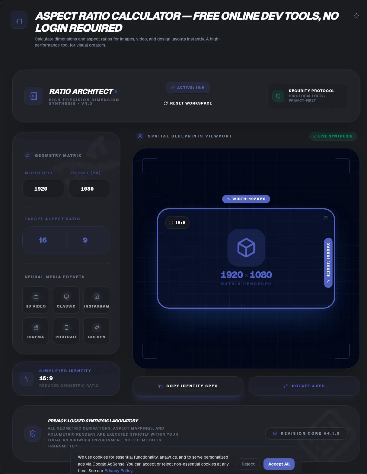
The ToolSura Aspect Ratio Calculator completes any proportional puzzle in your browser. Enter any three of width, height, or ratio and the calculator fills in the fourth, recalculating live as you type and showing both the reduced ratio and matching pixel dimensions together Source.
No signup, no upload, no waiting on a server, per the tool page; the math runs entirely client-side, so it keeps working even after the page has loaded offline Source.
What an Aspect Ratio Actually Is
A ratio expresses shape, not size. 16:9 describes any rectangle whose width measures sixteen units for every nine of height, whether those units are pixels on a phone or meters on a cinema screen. Two images can share a ratio while differing a thousandfold in resolution.
That distinction drives most ratio confusion. When someone asks what 16:9 means in pixels, the honest answer is that it means every pair from 640x360 up through 7680x4320. The calculator handles this correctly by design: give it a ratio plus one concrete dimension, and it returns the exact dimensions that preserve the shape at your scale.
Three Inputs, One Answer
The tool works in whichever direction your problem arrives Source. Know the width and target ratio? Height appears instantly. Working from a fixed height, like a platform's required canvas? The matching width computes the same way. Have raw dimensions from a screenshot? They reduce to their simplest ratio automatically, revealing that your 1920x1080 export and your 1280x720 thumbnail share one shape.
Reduction matters more than it first appears. Matching a design to an existing asset starts with knowing its true ratio, and simplified ratios make mismatched shapes obvious at a glance where raw pixel pairs disguise them.
The Math Behind the Tool
The underlying arithmetic is one multiplication, which the page documents openly: height equals width multiplied by the ratio's height over its ratio's width Source. A 1280-wide frame at 16:9 needs 1280 times nine sixteenths, which is 720. Running the inverse direction, a 1080-tall canvas at 16:9 demands 1080 times sixteen ninths, which is 1920.
Doing this by hand is easy once and tedious forever after, especially mid-project when dozens of sizes need checking across platforms. The calculator exists precisely because the operation is trivial yet constant, and because errors here propagate silently into stretched logos and cropped heroes.
Ratios Are Shapes, Not Sizes
Worth repeating because entire support threads rest on the confusion: there is no single pixel answer to "what is 16:9". The tool page makes the same point with its own examples spanning standard definitions from 720p through 4K Source. Every resolution on that spectrum shares one proportion.
This framing also explains conversion questions. Moving content between ratios never preserves everything: some geometry must change. The two escape routes are cropping, which discards edges, and pillarboxing, which adds bars. There is no third option that keeps all pixels and all proportions, despite what tool marketing sometimes implies.
Social and Video Sizing Conventions
Platform conventions cluster around a handful of shapes, and the tool's guide collects the practical numbers: YouTube thumbnails at 1280x720 with a 640-pixel minimum width, vertical short-form video at 1080x1920 for TikTok, Reels, and Shorts, and Instagram feed imagery spanning roughly 320 to 1080 pixels wide within ratios from 1.91:1 down to 4:5 Source.
Treat these as the page's collected guidance rather than platform law, since specifications drift. The workflow stays stable regardless: pick the target ratio first, produce master assets at generous resolution within that ratio, then derive each platform variant by scaling, never by stretching. The calculator verifies every derived dimension before export.
The CSS aspect-ratio Property
Modern CSS speaks ratios natively. MDN defines aspect-ratio as declaring "the desired width-to-height ratio of an element's box," letting browsers maintain that proportion as containers resize Source. One rule governs when it applies: at least one of the box's sizes must be automatic, or the property has no effect.
Set width: 100%; height: auto; aspect-ratio: 16 / 9 on a media wrapper and it holds cinema shape at every container width. For images specifically, the combined auto behavior is elegant: the specified ratio reserves space until the file loads, then the picture's natural proportions take over, exactly as documented for replaced elements Source.
Killing Layout Jank Before It Happens
MDN's guidance links aspect-ratio directly to preventing layout jank: when a browser knows an image's intended proportions before its bytes arrive, it reserves the right space immediately instead of shoving content downward mid-load Source. Cumulative layout shift is a measurable user-experience failure, and undeclared media dimensions are among its most common causes.
The habit is simple. For every img and video embed, either declare width and height attributes reflecting intrinsic proportions or apply CSS aspect-ratio. Use the calculator to derive those numbers from any known pair, so the declaration matches reality rather than approximating it.
Cropping vs Pillarboxing
When shapes must change, choose deliberately. Cropping removes content from edges and suits imagery with safe margins, like photos whose subjects sit centrally. Pillarboxing preserves everything by adding neutral bars, suiting screenshots, slides, and anything where edge detail carries meaning Source.
The tool page frames this honestly: converting 4:3 material to 16:9 costs either cropped edges or added bars, with no lossless path between. Deciding which cost to pay is an editorial choice about the content, not a technical one, and pretending otherwise produces stretched faces or clipped captions.
Ratio vs Resolution
Resolution counts pixels; ratio relates them. A 3840x2160 monitor and a 1280x720 video share 16:9 while differing fifteenfold in pixel count Source. Specs sheets list both because they answer different questions: resolution sets sharpness ceilings, ratio sets shape compatibility.
Production pipelines should treat them independently. Choose ratio from destination requirements, resolution from quality bandwidth budgets. The calculator's simultaneous display of both values reinforces the pairing: every computed answer arrives as a shape and a size together.
Print and Export Workflows
Print obeys the same geometry with sharper consequences. Trim sizes carry fixed ratios, and mismatched artwork gets cropped at the printer's discretion unless you fit it deliberately beforehand. Video exports behave identically inside editing suites, where render settings demand explicit dimensions matching your sequence's shape.
In both worlds the calculator serves as preflight: confirm the deliverable's dimensions divide down to the intended ratio before rendering or uploading, not after a proof arrives wrong. Seconds of arithmetic prevent wasted print runs and re-encodes.
How This Tool Fits Your Toolkit
Computing ratios pairs naturally with the neighboring utilities on ToolSura: resize images to the computed dimensions, compress the results for delivery, generate favicons at square ratios, and lay out responsive containers whose proportions you now control precisely Source.
The common thread is doing small, deterministic work locally and instantly. Ratio math will never need a server round-trip, and keeping it in the browser means the answer arrives before doubt does.
Common Ratios at a Glance
| Ratio | Shape | Familiar uses |
|---|---|---|
| 1:1 | Square | Avatars, app icons, favicon masters |
| 4:3 | Classic | Legacy TV, presentations, tablet screens |
| 16:9 | Widescreen | HD video, thumbnails, slide decks |
| 21:9 | Ultrawide | Cinematic formats, ultrawide monitors |
| 9:16 | Vertical | Short-form mobile video |
| 3:2 | Photographic | 35mm heritage, many camera sensors |
Keep this mapping in your head and most platform requirements stop being surprises. When a spec sheet names an unfamiliar ratio, reduce both dimensions through the calculator first; odd pairings often simplify into one of these familiar shapes hiding behind arbitrary pixel counts Source.
Key Takeaways
- An aspect ratio states shape, not size: 16:9 spans every resolution from 640x360 to 8K.
- Enter any three of width, height, and ratio; the fourth follows from one multiplication.
- Shape conversions always cost something: cropping loses edges, pillarboxing adds bars.
- CSS aspect-ratio declares preferred proportions and needs one automatic size to act, per MDN.
- Declaring ratios before media loads prevents layout shift, one of web performance's classic failures.
Frequently Asked Questions
How do I calculate height from a width and ratio?
Multiply the width by the ratio's height divided by its ratio's width. At 16:9, a 1280-wide frame becomes 1280 times nine sixteenths, which equals 720. The calculator performs this instantly in reverse too, so a known height yields the matching width, with live recalculation as values change.
What does the CSS aspect-ratio property actually do?
It declares a preferred width-to-height relationship for an element's box, which the browser maintains as surrounding dimensions change. MDN notes it only takes effect when at least one of the box's sizes remains automatic. For images, combining it with auto lets the declared ratio reserve space until the real file loads and its natural shape takes over.
Is 16:9 always 1920x1080?
No. 16:9 describes a shape shared by every resolution from 640x360 through 4K and beyond. 1920x1080 is merely the most familiar member. Give the calculator any single concrete dimension along with the ratio, and it returns the full correct pair at whatever scale your project needs.
How do I convert 4:3 footage to 16:9?
Choose between two imperfect options: crop top and bottom to fill the widescreen frame, losing vertical content, or add pillarbox bars to preserve everything within a wider canvas. No lossless conversion exists because the shapes truly differ. Which cost to accept depends on whether edge content or complete framing matters more for that footage.
What aspect ratio are vertical videos?
Short-form vertical video uses 9:16, with 1080x1920 as the conventional pixel size noted in the tool's guide for major short-video platforms. Produce masters taller than wide at that ratio, and use the calculator to derive platform-specific variants without accidental stretching during export.
Why do my images cause layout shift while loading?
Browsers reserve no space for media with unknown dimensions, so content jumps when files arrive and reveal their true heights. Declaring width and height attributes, or applying CSS aspect-ratio, lets layout compute final positions immediately. Deriving accurate declarations with a ratio calculator keeps the reservation honest and the page stable.
Does this calculator resize my images?
No. It computes numbers: missing dimensions, reduced ratios, and matched pixel pairs. Actual resizing belongs to an image resizer tool, compression to an image compressor. The intended flow is calculate here first, then pass exact target dimensions downstream so nothing gets stretched or guessed.
Related Tools
Finish the job alongside these:
- Image Resizer applies your computed dimensions.
- PNG/JPG Compressor trims the exported weight.
- Favicon Generator cuts perfect squares from logos.
- CSS Grid Layout Generator builds the containers your media lives in.
- Color Picker & Palette Generator keeps visuals consistent.
- Word Counter tightens the copy around your media.
Get the numbers right before the pixels move: the Aspect Ratio Calculator answers in one keystroke.