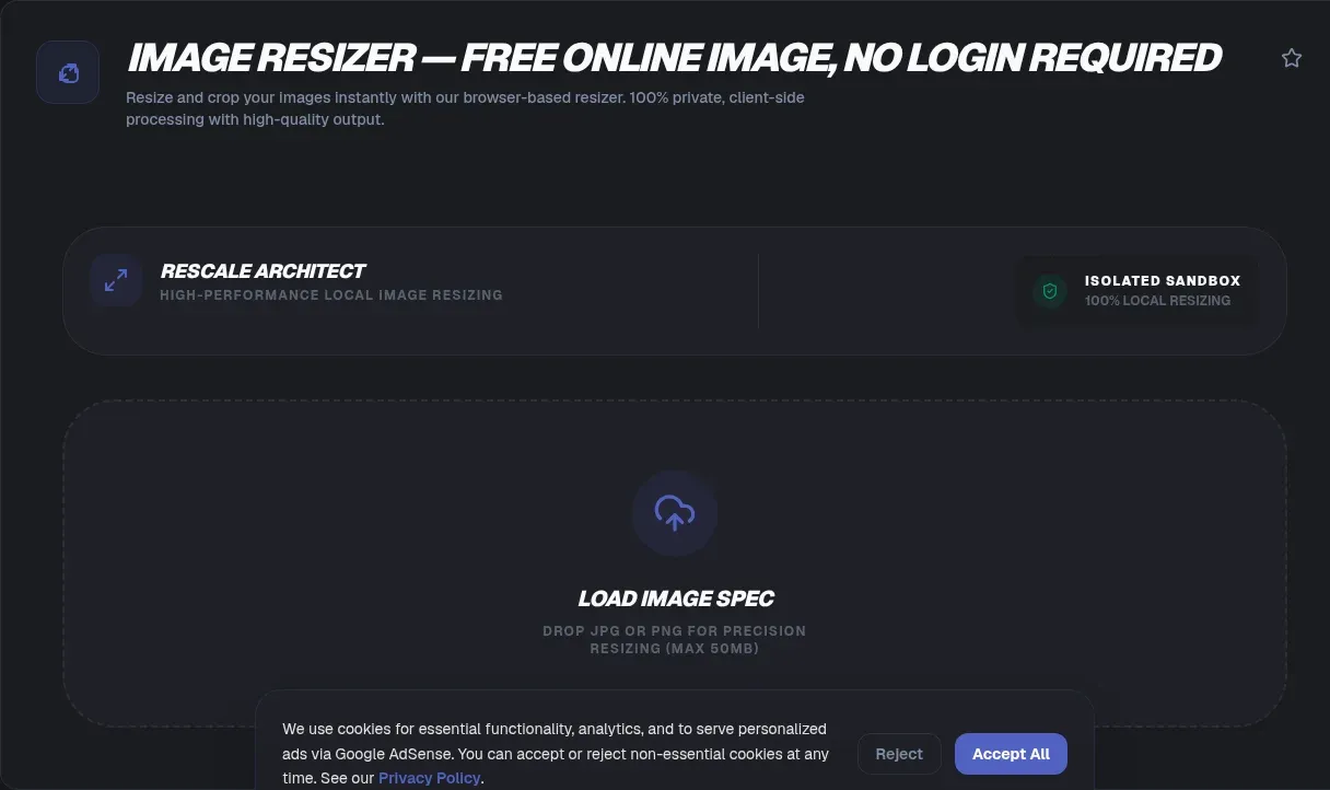
Your phone shoots 4000-pixel-wide photos, and almost nothing you upload them to needs more than a fraction of those pixels. The full-weight original gets sent anyway, every time. ToolSura's Image Resizer closes that gap entirely in your browser: drop files in, choose exact pixels or a percentage, and download correctly sized copies in seconds. Nothing is uploaded because nothing needs to be; the work happens on your own hardware.
That local model changes the experience as much as it protects your files. There is no upload progress bar, no account wall, no watermark, and no daily quota tied to somebody's server bill. This guide covers why oversized images cost the web so much, the exact dimensions each major platform expects in 2026, what really happens to pixels during a resize, and the traps that turn a five-second job into a sideways photo or a mushy export.
Key Takeaways
- Images dominate page weight: 1,054 KB of the median 2,652 KB desktop homepage load (HTTP Archive)
- Match output to destination: 1200×630 for link previews, 1080×1080 for Instagram posts, 1280×720 for YouTube thumbnails
- Downscaling is safe with proper filtering; enlarging can never restore detail the camera skipped (Wikipedia: image scaling)
- Modern browsers auto-apply EXIF rotation during canvas draws, so legacy rotate-first scripts now double-rotate phone photos
- ToolSura runs the whole workflow locally: no uploads, no caps, fully usable offline once the page loads
Why Are Oversized Images the Web's Heaviest Problem?
Images remain the single heaviest resource on the median homepage, accounting for 1,054 KB of a 2,652 KB desktop page load, roughly 40 percent, comfortably ahead of JavaScript's 613 KB (Web Almanac). Weight matters because images are the LCP element on 68% of mobile pages, so one bloated hero shot drags a Core Web Vitals score directly.
The distribution tells a stranger story. The largest image on a median mobile page weighs 135 KB, but at the 90th percentile it reaches 1,002 KB, nearly a full megabyte for one file (Web Almanac). Meanwhile the median individual image request is just 12 KB. Pages carry dozens of sensibly sized pictures, then one enormous original nobody downsized.
Oversizing usually isn't laziness; it's a workflow gap. Designers export masters, developers ship whatever arrives, and everyone hopes the browser will cope. Hope is not a delivery strategy, as the numbers in the next section show.
What Your Camera Gives You vs What Platforms Need
A typical smartphone sensor outputs about 12 megapixels, or 4000×3000 pixels, frequently 4032×3024 in practice. Even phones advertising 108 or 200 MP sensors default to roughly 12 MP output through pixel binning, where neighboring pixels merge to gather more light. That is the file sitting in your camera roll right now.
Now compare destinations. An Instagram square post renders 1080×1080, about 1.2 million pixels, under a tenth of your original. A YouTube thumbnail tops out at 1280×720. A favicon needs 48×48, or 2,304 pixels, roughly one five-thousandth of what the camera produced. Shipping originals to these surfaces wastes bandwidth on pixels no screen will ever display, and it hands the platform's scaler, rather than you, the decision over what gets discarded.
Which Platform Presets Matter in 2026?
| Destination | Size | Notes |
|---|---|---|
| Facebook / OG preview | 1200×630 | Minimum 200×200; under 600×315 renders a small thumbnail; 8 MB cap |
| Instagram feed | 1080×1080 or 1080×1350 | API accepts widths 320-1440, aspect between 4:5 and 1.91:1 |
| Instagram Story / Reels | 1080×1920 | Full 9:16 frame |
| X summary card | 1200×600 | 2:1; below 300×157 silently downgrades to a tiny summary card |
| LinkedIn preview | 1200×627 | Below 200 px wide collapses to a left thumbnail |
| LinkedIn banner | 1584×396 | Profile pages |
| YouTube thumbnail | 1280×720 | 2 MB cap, 16:9 |
Facebook's official guidance sets og:image at least 1200×630 with an 8 MB ceiling (Meta for Developers). YouTube's Data API defines the maxres thumbnail tier at 1280×720 and advises uploading frames as large as possible within the 2 MB limit (Google Developers). LinkedIn specifies 1200×627 for link previews and 1584×396 profile banners (LinkedIn Help).
Two conveniences fall out of the table. First, one 1200×630 master covers Facebook, LinkedIn, and most link-preview surfaces in a single export. Second, X falls back to og:image when twitter:image is absent, so a correctly tagged OG image quietly fixes Twitter cards too.
Why Bother Resizing When Browsers Shrink Images Anyway?
Because most pages never give browsers the chance. Only 42% of mobile pages use srcset at all, up from 34% in 2022, and only about 32% pair it with sizes, meaning most sites ship one file size to every screen (Web Almanac).
Even when developers write the markup, the hints misfire. Where sizes is used, the median desktop error is 43% too large, inaccurate enough on 20% of pages to trigger suboptimal selection and waste 55 to 179 KB per page (Web Almanac). Pre-sizing a 4000×3000 original down to its true display dimensions cuts transferred bytes several-fold, regardless of what any browser guesses later.
How Do You Resize Images Online Without Uploading?
The whole loop runs locally and finishes in under a minute:
- Drop your files. Drag images onto the canvas or browse to select them. Multiple files queue as a batch.
- Choose pixels or percentage. Enter exact dimensions like 1200×630, or scale to 50% of the original.
- Lock the aspect ratio. With the lock engaged, changing width recomputes height automatically, so nothing stretches.
- Pick format and quality. Export photos as JPEG around 80 to 90 quality, graphics as PNG, or anything as WebP for tighter compression.
- Process the batch. Each file resizes on your CPU in sequence, with previews you can inspect before committing.
- Download. Grab resized copies individually or as a set. Originals stay untouched on your disk.
Nothing in those six steps requires a network round trip after the page loads.
Should You Resize by Pixels or by Percentage?
Pixels win whenever a destination demands exact dimensions. Platform presets are stated in absolute terms, 1200×630 or 1080×1350, and hitting those numbers guarantees acceptance without surprise rescaling on the receiving end. Percentages also travel well across mixed batches, since a uniform 50% keeps relative sizes consistent across an entire folder.
Percentage wins for quick proportional trims. Halving a 4000×3000 photo to 50% yields 2000×1500 while preserving composition perfectly, useful when half is plenty but you haven't memorized any spec sheet. Rule of thumb: percentages for archives and email attachments, pixels for publishing anywhere with a documented size chart.
What Happens Under the Hood During a Resize?
Browser canvases expose the quality dial directly. The imageSmoothingQuality property accepts low, medium, or high, with low as the default; the spec suggests low maps near bilinear filtering while high approaches bicubic or Lanczos-class reconstruction (MDN). Leave it at default and an aggressive shrink can turn soft or aliased (WHATWG HTML Standard).
A second native path exists: createImageBitmap() resizes during decode, accepting resizeWidth, resizeHeight, and a resizeQuality of pixelated, low, medium, or high. Set only one dimension and the other derives proportionally from the source rectangle, which is aspect-ratio locking built into the platform itself (MDN). Feeding the resulting bitmap onward to drawImage() completes the standard pipeline (MDN).
Serious JavaScript resizers go further than either built-in path. pica inserts intermediate stages capped at a 128× scale factor per step, because single-pass downsampling destroys detail, then applies a recommended unsharp mask, amount 160, radius 0.6, threshold 1, to restore perceived sharpness (pica on GitHub). Multi-stage beats one big jump whenever the factor gets extreme.
Does Downsampling Really Lose Quality?
Handled well, no, not in any way your eyes will catch. Downsampling discards pixels the destination never displayed, and with bicubic or Lanczos-class filtering the result stays visually indistinguishable from the source at normal viewing size. The removed information was surplus.
Real damage has identifiable causes: nearest-neighbor scaling that aliases edges into staircases, repeatedly resaving a JPEG so generations of quantization artifacts stack, or collapsing 95% of the pixels in one brutal step. Notice that none of these is inherent to shrinking. They are algorithm and workflow failures, which is why picking a tool whose filtering you can trust matters more than fearing the operation itself.
Why You Cannot Upscale Your Way Out
Cambridge in Colour states it plainly: "interpolation can never add detail to your image which is not already present." Enlargement invents pixels by averaging neighbors, and the price appears as blur, halos along high-contrast edges, or aliasing (Wikipedia: image scaling).
AI upscalers change the failure mode, not the math. They synthesize plausible texture, which suits stylized artwork and betrays scrutiny elsewhere; a guessed face is not the face that was photographed. Practical rule: shrink freely, enlarge reluctantly, and when a source is too small, reshoot or find a larger original instead of inflating a thumbnail into a hero banner.
What Is the EXIF Rotation Trap?
For decades cameras stored orientation as a small EXIF tag instead of rotating actual pixels, leaving every viewer to read the metadata and compensate. Around 2020 that contract changed: Chrome 81, Safari 13.1, and Firefox 76 began applying the EXIF Orientation tag automatically inside drawImage(), following the CSS image-orientation default (MDN).
The migration broke naive scripts everywhere. Code written before 2020 reads the tag, rotates pixels manually, then hands the result to a modern browser that rotates again: portraits emerge flipped 180 degrees, landscapes stand on end. Explicit control exists through createImageBitmap's imageOrientation option, but the simpler fix is a resizer that applies orientation exactly once. ToolSura does, which is why phone portraits come out upright instead of sideways.
JPEG, PNG, or WebP: Which Output Format Wins?
Match format to content. Photographs compress best as JPEG at quality 80 to 90, or as lossy WebP, which Google's study measured at 25 to 34% smaller than JPEG for equivalent SSIM quality (Google WebP Study). Sharp-edged graphics, screenshots, and text belong in lossless PNG, where ringing artifacts cannot creep in.
Transparency narrows the field further. JPEG has no alpha channel and flattens see-through regions onto a background, so logos and overlays need PNG or WebP. Lossless WebP runs about 26% smaller than comparable PNG files, and lossy WebP with alpha lands near three times smaller, the compact choice when transparency must survive (Google WebP Study). Both formats preserve alpha through a canvas resize; the channel rides along untouched.
Can You Batch Resize Without Upload Caps?
Yes, structurally rather than generously. Cloud resizers meter usage because every uploaded megabyte costs ingress, storage, and egress, which is why free tiers carry daily limits and deletion windows measured in hours. Local processing removes that cost structure entirely, so quotas stop making sense; your CPU doesn't charge per photo.
Batch mode queues every dropped file and processes them sequentially against your hardware. After the page loads, the connection could vanish and everything would still work, which doubles as the strongest possible privacy proof. The honest ceiling is RAM: a hundred 4000×3000 photos takes time and memory, but no gatekeeper interrupts you.
Common Mistakes When Resizing Photos
Six repeat offenders cause most botched resizes:
- Upscaling to meet a spec. Stretching a 600-pixel logo to 1200 produces blur, not compliance. Find a bigger source.
- Ignoring aspect ratio. Forcing 1080×1920 onto a square photo distorts faces. Crop first, then resize.
- Re-saving JPEGs repeatedly. Every generation re-quantizes. Start from the original each time.
- Exporting photos as PNG. Files balloon five to ten times for zero visible gain on photographic content.
- Forgetting EXIF orientation. Manual rotation stacked on automatic browser rotation turns portraits sideways.
- Cropping after resizing. Crop to composition first, then size the result, or you throw away resolution the crop would have kept.
Related Tools
Resizing slots into a wider local-first pipeline, and every tool below runs client-side too:
- PNG/JPG Image Compressor: already sized correctly but the file still heavy? Squeeze the remaining bytes out.
- WebP to PNG/JPG Converter: turn WebP exports back into universal formats for older software.
- Favicon Generator: cut a logo down to the full 16 through 512 pixel icon set in one pass.
- Base64 Image Encoder: inline small resized images straight into HTML or CSS.
- SVG to PNG Converter: rasterize vector logos first, then resize to exact icon dimensions.
- Color Blindness Simulator: check infographics for accessible contrast before you publish them.
A right-sized image ships faster, ranks better, and never leaks your files to a stranger's storage bucket. Point your oversized camera rolls at the Image Resizer, pick a preset, and keep every byte on your side of the wire.