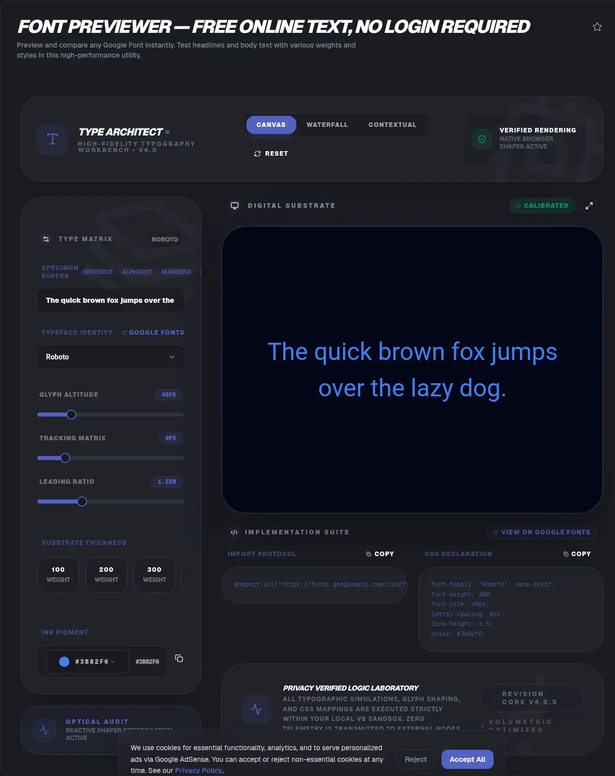
The Google Fonts Previewer is a free, privacy-first tool that renders fonts directly in your browser so your sample text never leaves your device. You type what you want, pick a typeface, and see it instantly. There is no upload, no signup, and no server that ever reads your words.
Most online font tools send your text to a remote server to render a preview. That round trip is slow and it also exposes what you typed. ToolSura does the opposite. Every glyph is drawn locally through the CSS @font-face rule, so the only thing your network touches is the font file itself. The result is a preview that loads in milliseconds and keeps your copy private. Because nothing is posted, the text can hold a draft headline, a client name, or anything else you would never paste into a form.
What Is a Font Previewer?
A font previewer is a tool that shows how a typeface looks with your own words before you ship it. Google Fonts alone lists about 1,942 families you might test (Google Fonts, live), and the catalog keeps growing. The CSS font-family property lets a browser stack fallbacks, as MDN explains, but a previewer shows the real rendered result, not just a name in a list.
Under the hood a previewer loads the same files a browser would ship: WOFF2 for modern browsers, with TTF or OTF as fallbacks. WOFF2 uses Brotli compression, which is why a preview feels instant even on a phone (W3C). You are seeing the exact bytes your visitors would download, not a bitmap approximation, so what you tune is what they get.
A previewer is not a font manager. A manager installs files on your operating system and sorts them into collections you can reuse across apps. A previewer only displays how text looks, and it needs no install at all. You can test a face in seconds, then move on without touching your system fonts folder or committing to a download.
Why ToolSura's Google Fonts Previewer Is Different
ToolSura's Google Fonts Previewer runs entirely in your browser, so your text and IP address never reach a server. A German court ruled that a site using the Google Fonts API violated GDPR by passing visitor IP addresses to Google without consent (Wikipedia). Local rendering sidesteps that risk completely, because the page never asks a third party to do the work.
Many preview sites ask you to type into a box that is posted to their backend. That means a copy of your draft headline, secret product name, or patient wording sits on someone else's disk. ToolSura renders through the @font-face rule in the page itself. Nothing you type is uploaded, logged, or analyzed by a third party. The preview works the same on a laptop, a phone, or a locked-down network with no outbound form traffic.
How Do You Use the Google Fonts Previewer?
Using the Google Fonts Previewer takes under a minute and needs no account. You type, pick, and adjust, all in your browser. The whole flow stays local, so even a slow connection only affects the first font download, not your privacy.
- Type your sample text in the input box. Use a real sentence, not placeholder words, so spacing feels true.
- Search or scroll the font list and click a family to apply it instantly.
- Drag the variable axis sliders, such as weight, width, and slant, if the font supports them.
- Toggle a second font on to compare two faces side by side.
- Copy the generated CSS snippet or link tag when you are happy with the result.
Variable-Font Axes You Can Preview
Variable fonts pack many weights and widths into one file you can preview on a single slider. The OpenType spec defines five registered axes: wght, wdth, slnt, ital, and opsz (MDN). Custom axes use four-letter tags through font-variation-settings. Monotype has reported that moving from dozens of static files to one variable font cut file size by about 88 percent, which is why a single slider can replace a wall of separate downloads (web.dev).
The CSS2 API exposes those axes as ranges, so [email protected] asks for every weight between 200 and 900 in one request. The previewer maps each slider position to a point inside that range, which is why dragging feels continuous instead of stepping through named styles. Custom axes such as grade or optical size follow the same rule, so a typeface with a soft axis still previews smoothly.
A static family once meant downloading twenty files for each weight you wanted. Variable fonts collapse that into one, which the W3C WOFF2 spec shows is roughly 24 to 27 percent smaller than older WOFF for TrueType outlines (W3C). Sliding an axis in the previewer shows the change with no page reload, so you can watch a headline go from hairline to heavy in one motion.
Width and optical size matter more than people expect. A narrow wdth can fit a headline in one line, while opsz tunes stroke weight for small screens so body text stays crisp. Previewing these live beats guessing from a static specimen, because your actual text reveals spacing problems a sample sentence hides.
How Do You Pair Fonts Well?
Pairing fonts works best when you match a serif heading with a sans body for instant contrast. Typography guides recommend using no more than two families and lining up their x-heights so sizes feel consistent (Butterick's Practical Typography). That keeps a page calm and readable instead of busy.
Look at stroke contrast, not just the typeface name. A high-contrast serif over a neutral sans looks intentional, while two loud display faces fight for attention. Match x-heights so your heading and body sit on the same baseline rhythm. ToolSura's side-by-side view lets you test a pairing with your own text before building it, so you catch a bad match in seconds rather than after launch.
Check the contrast between heading and body, not just within each. A 400 body over a 700 heading can look top-heavy, while 500 over 700 feels balanced. ToolSura shows the two faces on the same line so you can read across the boundary and spot a weight clash before it reaches the stylesheet. A practical start is one transitional or old-style serif for headings paired with a humanist sans for body, with weights kept close so the pair reads as one system.
When in doubt, preview the pair at the exact sizes you will ship. A heading at 32px and body at 17px rarely look like their 200px specimen counterparts, so the previewer's live sizing is the only honest test. Resist adding a third family for emphasis, because color or weight already does that job without the clutter.
What Are FOUT, FOIT, and font-display?
FOUT and FOIT are the two failure modes of web fonts, and font-display decides which you get. FOIT hides text until the font arrives, while FOUT shows a fallback first. The web.dev team notes swap gives zero block time and infinite swap, avoiding invisible text (web.dev).
FOIT, the Flash of Invisible Text, leaves a blank space for up to three seconds. FOUT, the Flash of Unstyled Text, swaps mid-read and shifts layout. The CSS2 API supports a display parameter with values like swap, fallback, and optional (Google Fonts). Pick swap for previews and optional for production speed, where skipping a late font beats a layout jump.
About 84 percent of desktop pages use web fonts, and Google Fonts appears on roughly 64 percent of them, so these flash behaviors touch most sites you visit (HTTP Archive). Knowing which mode you are in helps you choose a fallback that matches the final face, which is the real cure for the jarring swap.
How Do You Grab the CSS Snippet or Link Tag?
You can copy a ready CSS snippet or a link tag straight from the previewer when a font fits. The modern endpoint is the CSS2 API at fonts.googleapis.com/css2, which supports axis syntax like family=Name:wght@400;700 (Google Fonts).
Add a preconnect hint so the browser opens the socket early. The text= parameter also trims the file by up to about 90 percent when you only need a fixed set of characters. ToolSura hands you the exact markup, so pasting it into your project renders the same face you previewed. A typical setup pairs a link tag with one CSS rule:
<link href="https://fonts.googleapis.com/css2?family=Inter:wght@400;600&display=swap" rel="stylesheet">

/* In your stylesheet */
font-family: 'Inter', sans-serif;
Paste both and the face you previewed is the face your visitors get.
For self-hosting, tools like google-webfonts-helper let you download subset WOFF2 files and drop the CDN request entirely, which also removes the GDPR exposure from the Munich ruling. You keep full control of caching and never send a visitor's IP to a font CDN.
Can You Preview Fonts Offline?
Yes. Once a font file is cached by the browser, the previewer renders it with no network at all. The first load fetches the WOFF2 over the wire, and every visit after that pulls from local storage, so a train or a plane is still a working studio. ToolSura keeps the logic on the device, so offline preview is the default state rather than a feature you switch on. You only lose the ability to pull a brand new family until you reconnect, and your saved comparisons stay put. If you preview the same family on repeat visits, the second open is instant, which makes quick A/B checks painless.
Is a Bigger Font Always More Readable?
A bigger font is not automatically more readable, and cranking size can hurt a layout. Readability rests on line-height, line length, and contrast more than point size. WCAG suggests body line-height of at least 1.5 and a 4.5:1 text contrast for AA compliance (web.dev).
WCAG sets two bars: 4.5:1 for normal text at AA and 7:1 at AAA. Those ratios compare your text color to its background, and they apply to the rendered font, not the chosen hex. A thin weight can fail AA where a medium weight passes, which is why previewing the real face matters more than trusting a contrast picker on a system font.
Large type is not a fix for poor spacing. A 20px face with tight 1.1 line-height tires the eye faster than 16px at 1.6. Keep body lines between 45 and 75 characters wide and never drop below 16px on screens. ToolSura shows these metrics live so you can tune before shipping, and you can watch a long paragraph hold its rhythm as you nudge the size.
Key Takeaways
- Previews draw locally through CSS @font-face, so only the font file itself crosses the network.
- Variable-font axes adjust weight and width live instead of loading a file per style.
- FOUT, FOIT, and font-display choices decide whether readers wait, swap, or see fallbacks.
- Copyable link tags and CSS snippets wire any previewed family straight into your site.
- Pairing contrast plus legibility checks beats reaching for ever bigger point sizes.
Related Tools
ToolSura's Case Converter fixes text casing before you preview it in a font. The CSS Gradient Generator builds backgrounds that make type stand out. Check legibility with the Color Contrast Checker, and move markup cleanly using the Markdown to HTML Converter. The Word Counter keeps sample copy inside length targets while you test sizes, and the CSS Minifier slims your stylesheet once the family ships. Type sets the tone of every page, and ToolSura's Google Fonts Previewer lets you audition families privately before a single visitor meets them.