
A ratio is a relationship, not a size: what 16:9 can and cannot tell you
· 9 min read
An aspect ratio is a relationship, not a size. 16:9 fixes no pixels until you give it one dimension: the maths, the six-rung ladder, and drifting labels.
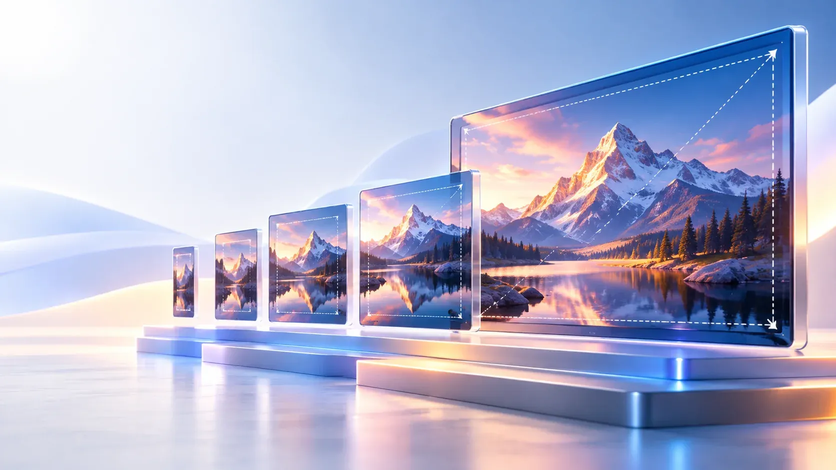
Most aspect ratio confusion traces back to one missing idea: a ratio relates two quantities to each other, and a relationship pins neither one down. 16:9 says the width is a certain number of times the height. It does not say what either of them is. Ask someone for "a 16:9 image" and the honest reply is a question: how wide?
That gap explains why "make it 16:9" is under-specified: the instruction names a shape and omits the input a shape needs to become a file. It also explains why two photographs cropped from the same frame can carry the same ratio while sharing almost nothing else.
The rest is short arithmetic, and the ToolSura aspect ratio calculator runs exactly that: four text fields, one multiplication, one rounding step. A grep of its client component and all five sub-components finds no fetch, no XMLHttpRequest, no FormData, no FileReader and no file input. Nothing is uploaded because there is nothing to upload.
One boundary first, because the head term is crowded. This is width over height, in pixels. A tyre sidewall code, a projector throw, a percentage split and a DPI conversion all borrow the word "ratio", and none of them is what follows.
What an aspect ratio is
Wikipedia's display aspect ratio article defines the thing as "a proportional relationship between the physical width and the height of display", expressed as a pair of integers separated by a colon. Proportional relationship. That is the whole definition, and everything below is a consequence of it.
The colon is a division that has not happened yet. 16:9 means 16 ÷ 9, and that quotient, 1.777 and some, is a multiplier, not a size. Nothing in it is measured in pixels.
Two numbers, never one. "16" on its own has nothing to be relative to, and 8:4.5 means exactly what 16:9 means.
Decimals are legitimate and unavoidable: 1.91:1, 2.39:1 and 1.78:1 all describe real screens. The calculator follows Wikipedia's split: integer pairs get divided by their greatest common divisor, decimal pairs are left as typed. Its own source comment records why: running 1.91 through an integer GCD produced the unusable 128:67.
Three inputs, one answer
The tool has four fields: width, height, ratio width, ratio height. Give it any three and it fills the fourth. The arithmetic is one multiplication:
height = round(width × ratioHeight ÷ ratioWidth)
1280 × 9 ÷ 16 = 720, exactly. The inverse runs the same way: 1080 × 16 ÷ 9 = 1920, exactly.
Which input wins is decided by where you type. The calculator tracks an internal anchor, so typing a height after a width does not silently discard that width. A comment in the source records the bug the design came from: "a width of 1000 and then a height of 500 silently discarded the 1000".
The fourth output matters most. After solving, the panel tests whether the pixel pair is the ratio you asked for, at the tolerance |w ÷ h − rw ÷ rh| < 0.000000001. If it is not, it prints the pair's true reduced form beside your target.
Try width 1366, height 768, target 16:9. The greatest common divisor is 2, so the pair reduces to 683:384. Meanwhile 1366 ÷ 768 is 1.778646 against 16 ÷ 9 at 1.777778: a gap of about 0.00087, roughly 870,000 times the tolerance. So the panel shows target 16:9 and, beside it, actual 683:384. Nothing demonstrates that 16:9 and 1366 × 768 are different things more cleanly.
One guardrail detail: pixel fields silently clamp at 100,000 while ratio fields reject anything above 100 with a visible error. Type 150000 into a width box and you get 100000; type 150 into a ratio box and you get a message.
The 16:9 ladder has six exact rungs, not seven
The resolution ladder is anchored on width: seven anchors at 640, 854, 1280, 1920, 2560, 3840 and 7680. Each rung's height is round(width × 9 ÷ 16), then re-tested for exactness.
Six of the seven pass. 640 × 360, 1280 × 720, 1920 × 1080, 2560 × 1440, 3840 × 2160 and 7680 × 4320 all divide to 16:9.
854 does not. 854 ÷ 480 is 1.779167; 16 ÷ 9 is 1.777778. The gap is 0.001389, nowhere near the tolerance, so the ladder renames that rung 854 wide instead of calling it 480p. The consequence is worth stating plainly: 480p never appears at 16:9 at all. There is no whole-pixel 16:9 frame 480 pixels tall, because 480 × 16 ÷ 9 = 853.33.
That matters because the ToolSura tool page says 16:9 spans every resolution from 640x360 to 8K. Read as a claim about the ratio, that is true. Read as a description of the ladder, it is not. The 854 rung is not 16:9, and the tool labels it for what it is.
A naming trap sits underneath this. The familiar 720p and 1080p labels are height conventions, not width ones, and this ladder is anchored on width. The source comment says reusing them on an inexact rung "would be a lie", so they appear only where the arithmetic lands cleanly. Run the same test at 4:3 and the verdict matches: 854 × 640 is 1.334375 against 1.333333, so that rung fails too.
A ratio is not a resolution
A ratio is a shape. A resolution is a pixel count. 1920 × 1080 and 3840 × 2160 both reduce to 16:9 (divide the first by 120 and the second by 240), and the second carries four times the pixels. Two files, one shape.
The sharpest evidence is a naming problem in Wikipedia's own table. Its 16:9 row lists 3840×2160 (4K UHD), "The default aspect ratio for HDTV and modern computer displays." A separate row, 256:135, lists 4096×2160 as "The Digital Cinema Initiatives standard for 4K resolution; specification created in 2005 but not widely sold until 2014–15".
Both are 4K. One is 16:9. The other is about 1.96:1, which is wider and not remotely the same shape. If the label told you the ratio, those two products could not both be allowed to use it.
The 21:9 row is the same lesson at smaller scale, and Wikipedia hedges it in its own text: high-end ultrawide monitors "are commonly marketed as" 21:9. Read the arithmetic instead. 2560 × 1080 divides by 40 to give 64:27; 3440 × 1440 divides by 80 to give 43:18. When a spec sheet gives you both a pixel pair and a ratio, compute the ratio: a panel sold as 2560 × 1080 and labelled 21:9 is 64:27, and framing it to true 21:9 will not land on whole pixels.
Why 4:3 outlived the CRTs
4:3 was television's shape before widescreen was, and movie cameras set it. Wikipedia's fullscreen article says fullscreen "refers to the 4:3 (1.33:1) aspect ratio of early standard television screens and computer monitors", and that such ratios "have been in use since the invention of moving picture cameras".
CRTs did not have square pixels. From the display aspect ratio article: "For cathode ray tubes (CRTs) 4:3 was most common even in resolutions where this meant the pixels would not be square (e.g. 320×200 or 1280×1024 on a 4:3 display)." That explains the survivor: 4:3 outlived its hardware because the hardware went away without taking the shape with it.
16:9 won as a deliberate compromise. "This aspect ratio was chosen as the geometric mean between 4:3 and 2.35:1, an average of the various aspect ratios used in film." The midpoint between a television shape and a cinema shape, which is why a 16:9 television letterboxes one and pillarboxes the other.
The handover was slow, then abrupt. "Most televisions were built with an aspect ratio of 4:3 until the late 2000s, when widescreen TVs with 16:9 displays became the standard." Computer monitors lagged: until about 2003 most were 4:3, some 5:4.
And 4:3 did not die. The same Wikipedia table calls it the standard for early 35mm film and says it is "Used on some modern devices such as the iPad." The switch left a permanent trace: "Most modern TVs are 16:9, which causes letterboxing when viewing 21:9 content, and pillarboxing when viewing 4:3 content such as older films or TV broadcasts, unless the content is cropped or stretched."
A percentage is not a ratio
A ratio needs two numbers. A percentage needs a total, and "60%" on its own never says what the total is.
The arithmetic here is usually stated badly, so fix it first. "60% is not 3:2" is false. Supply the complement and 60:40 divides by 20 to give exactly 3:2. What a lone 60% cannot do is anything, because it has no second term. It cannot be reduced, scaled, or realised in pixels, since nothing in it says what 100% measures. That is a missing input, not an arithmetic dispute.
The asymmetry that matters in practice: two equivalent percentages, 60% and 40%, describe the same split, and 60% alone does not say which side of the frame it is. Two ratios never have that problem: 60:40 and 40:60 are different images. A ratio stays directional until you name the sides.
If what you want is a total divided across parts in fixed proportions, with the leftover unit handed out by a rounding rule, that is a different calculation with different failure modes, and a different tool.
Named ratios, and where the labels drift
Every row is sourced from the same Wikipedia table.
| Ratio | Decimal | Example resolutions | Where it still turns up |
|---|---|---|---|
| 16:9 | 1.78:1 | 1920×1080, 2560×1440, 3840×2160 (4K UHD) | "The default aspect ratio for HDTV and modern computer displays" |
| 4:3 | 1.33:1 | 1024×768, 1600×1200, 2560×1920, 960×720 | "Used on some modern devices such as the iPad" |
| 16:10 (8:5) | 1.6:1 | 1280×800, 1920×1200, 2560×1600, 3840×2400 | "Continued use on MacBooks, since 2021 becoming increasingly popular again in notebooks" |
| 3:2 | 1.5:1 | 2160×1440, 3000×2000, 1500×1000 | "Popularity has increased in recent years, e.g. in Microsoft Surface devices" |
| 21:9 | marketed | 2560×1080 (64:27), 3440×1440 (43:18) | Ultrawide monitors "commonly marketed as" 21:9 |
| 1:1 | 1:1 | 1920×1920 | "Used in some desktop and professional monitors" |
That table's 16:9 row also lists 1366×768, which the solve above shows is 683:384 rather than an exact 16:9.
Two honest notes rather than padding. The 1:1 row is thinly sourced: the only external claim in this research pass is "some desktop and professional monitors", and no web-usage claim for square images was verified here. There is deliberately no 2:1 row either: no source read in this pass supplied an example resolution for it, and a row built from memory is worse than a missing row.
The CSS aspect-ratio property
The calculator emits a CSS snippet. MDN's reference for aspect-ratio "allows you to define the desired width-to-height ratio of an element's box."
Then the rule that catches everyone out, which is this post's rule again: "At least one of the box's sizes needs to be automatic in order for aspect-ratio to have any effect." Fix both dimensions in CSS and the ratio is ignored, the same under-specification arriving in a different place.
The syntax carries a lesson too. "If height and the preceding slash character are omitted, height defaults to 1." So aspect-ratio: 16 / 9 and aspect-ratio: 1.78 are the same declaration. The property is showing you how a bare decimal ratio is meant to be written: 1.78:1.
For images there is a refinement: when both auto and a ratio are given, "auto is used if the element is a replaced element with a natural aspect ratio, like an <img> element." That reservation is the fix for layout jank, covered at greater length on the tool page.
What the calculator cannot do is decide what happens when two shapes disagree. CSS makes that choice with object-fit. Under contain, content "will be ‘letterboxed’ or ‘pillarboxed’ if its aspect ratio does not match". Under cover it fills the box and the object "will be clipped to fit". Bars or a crop. The calculator produces dimensions; you make the framing call.
One gap declared rather than papered over: the browser-support position for this property could not be confirmed from any source in this research pass, so no version numbers appear here.
What this calculator will not do for you
Several things share this head term, and none of them is a width-over-height calculation.
Tyre aspect ratio codes such as 205/55 R16 are sidewall millimetres and rim diameter in inches. Different quantities, different arithmetic. There is no tyre tool on this site and this post does not cover them.
Projector screen sizing needs a distance, a desired width, and the projector's own throw ratio, which is a spec of the projector and not of the image. This tool works in pixels and has no unit for inches or feet.
DPI and physical print size are a separate calculation: inches equal pixels divided by DPI. No density input exists in any of the four fields, so for a print target start with Reduce Image File Size Without Losing Quality, where density is one of the levers.
Percentage-split allocation divides a total across parts in fixed proportions and assigns the leftover unit by a rounding rule. That is what the Ratio Calculator does, and Ratio Remainder Rounding: Why Your Split Adds Up Wrong covers the arithmetic. Contrast ratio shares only the word too: the accessibility ratio in the WCAG Contrast Ratio Guide is a luminance relationship.
Paper trim sizes get one principle rather than a table of numbers. Trim sizes carry fixed ratios (Wikipedia puts A4 at about 1.41:1), and artwork that misses one gets cropped at the printer's discretion. Per-size dimensions for common North American trims were not verified in this pass, so none are listed.
Related Tools & Further Reading
- Aspect Ratio Calculator — the tool this post explains: four fields, live CSS, a tested resolution ladder, all in the browser.
- Image Resizer — the other lever. Once the ratio is settled, changing pixel dimensions is a separate operation with its own tradeoffs.
- Reduce Image File Size Without Losing Quality — dimensions are one of three reasons an image is heavy; this covers the other two.
- How to Compress Images for Web — the delivery workflow once your dimensions are fixed.
- The Complete Image Tools Guide — the whole toolkit, for when you are working through a pipeline rather than one decision.

Written by
Sunil Kapoor
My attention goes to the two decisions that are made once and then applied to a hundred files. Aspect ratio is the first. A resize that forces a source image into a fixed frame either crops or distorts, and both are visible. The choice of which depends on the destination: a profile photo wants a centre crop, a banner wants letterboxing or a regenerated design, and a product photo wants neither.
Deciding once and applying it to everything is how a batch job produces two hundred files with the subject cut off. Upscaling is the second. A larger image cannot be recovered from a smaller one, so enlarging produces a file with more pixels and no more detail.
It can still be the right choice for a fixed layout, and I cover when it is acceptable versus when it is a way of pretending a missing asset exists. Resampling method matters more at large reductions than people expect. Averaging and similar methods avoid the aliasing that nearest-neighbour produces, and aliasing shows up as jagged edges that look like a sharpening problem and are not.
Sharpening should come after resizing, never before, because sharpening a small image amplifies the very artefacts resizing introduces. Colour profiles need deciding once too. Resampling in the wrong space changes the appearance of the result, so a profile-aware resize and a naive one produce visibly different images from the same source. I end every page on output naming, because a batch that overwrites its own source has no undo.