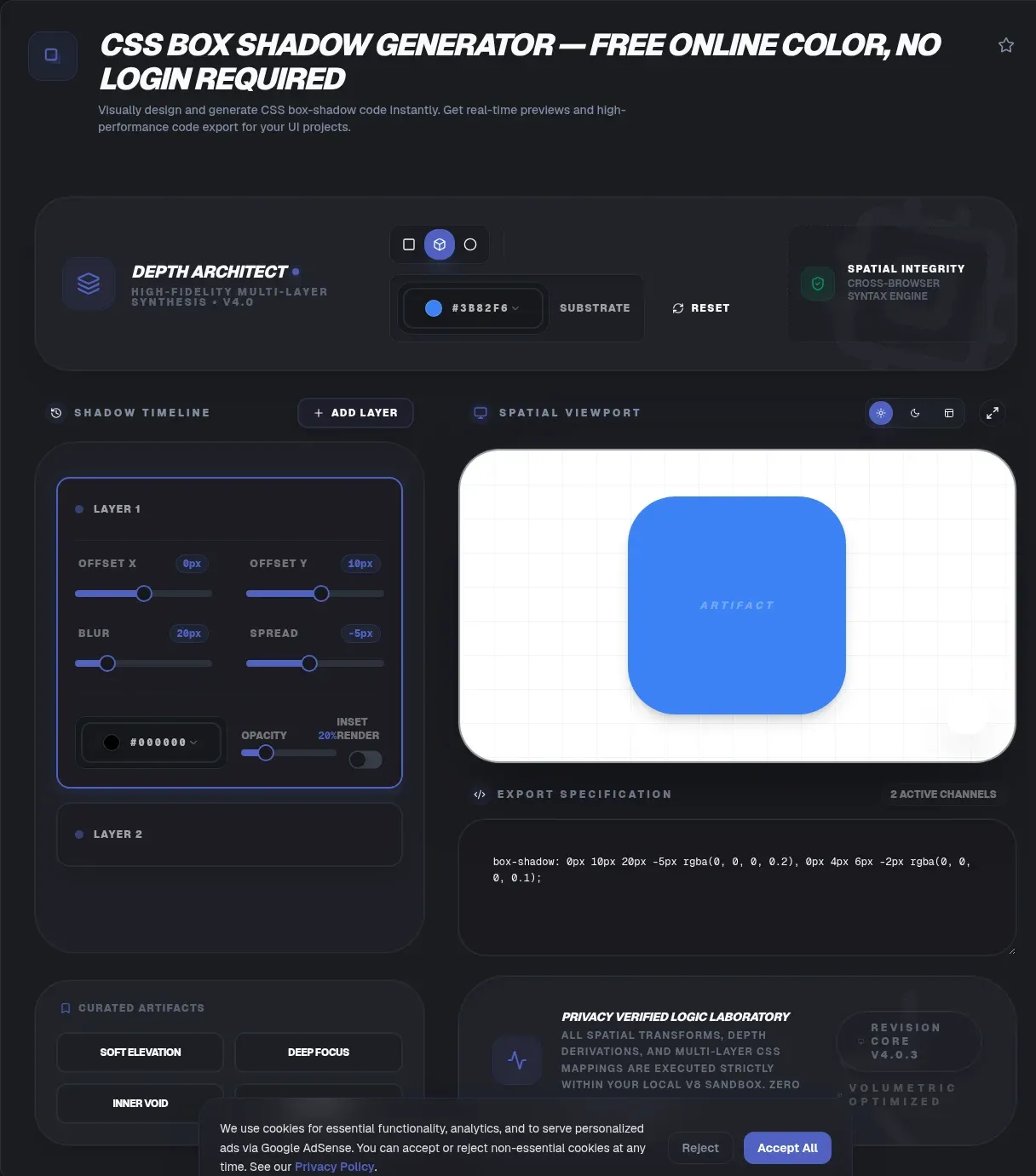
A good shadow makes flat layouts feel physical, yet hand-writing box-shadow values invites typos and trial-and-error. A CSS box shadow generator removes the friction: move a slider, watch the live preview respond, and copy production-ready CSS. ToolSura's version runs entirely in your browser, so the values you shape never touch a server at any point.
Every calculation happens client-side because nothing is uploaded while you design. There are no accounts, no network calls, and no history of the colors or dimensions you test. Below, you will find the syntax behind the tool, elevation thinking, dark-mode strategy, performance costs, accessibility rules, and Tailwind conversion recipes.
Key Takeaways
- Drag sliders, preview live, and copy CSS with zero uploads.
- box-shadow has been Baseline widely available since July 2015, per MDN Web Docs.
- The first shadow listed paints on top; inset clips inside the padding box.
- Animate transform and opacity instead of shadows to skip costly paint work.
- Pair shadows with real outlines for accessible focus states.
What Is a CSS Box Shadow Generator?
A CSS box shadow generator is a visual editor for the box-shadow property. Sliders set horizontal and vertical offsets, blur radius, spread radius, and color; a toggle applies the inset keyword; a preview canvas shows the result; and an output panel emits the finished declaration. MDN ships its own interactive generator beside the property docs (MDN Web Docs), proof of how central this workflow has become for front-end work.
ToolSura keeps the workflow lean. The preview tracks every slider movement, the snippet copies in one click, and the page keeps working offline once loaded. Developers reach for it during rapid prototyping, designers use it to translate mockup depth into code, and learners use it to watch each number reshape the shadow in real time.
How Does the box-shadow Syntax Work?
MDN's box-shadow reference (updated May 23, 2026) states the property accepts two, three, or four length values: the first two set offset-x and offset-y, an optional third adds blur-radius, an optional fourth adds spread-radius, and an optional color plus the inset keyword complete the value (MDN Web Docs).
Defaults deserve attention. Omit the color and the shadow falls back to the element's own color property. Skip blur and spread and both act as zero. Negative blur is invalid outright, while negative offsets and negative spread are perfectly legal; positives push the shadow right and down, negatives pull it left and up.
Where is this pinned down? The classic reference is CSS Backgrounds and Borders Module Level 3, currently a W3C Candidate Recommendation Draft dated March 11, 2024 (W3C). MDN's formal-syntax block now reflects a newer Level 4 grammar while cautioning that not every browser implements every part of it, so the six-part L3 model remains the safest way to teach the value.
What Is the Difference Between Blur and Spread?
Both properties resize the shadow's footprint, but differently: blur fades the edges outward for softness and cannot be negative, while spread grows or shrinks the solid silhouette before blurring begins, with positive values expanding and negative values contracting it (MDN Web Docs).
Here is the mental model that sticks: spread sizes the hard shape, blur decides how soft its rim looks. Realistic ground shadows pair generous blur with small or negative spread and low-alpha color. Crisp retro styles invert the recipe: minimal blur, moderate spread, full opacity. Toggle both in the preview and the difference clicks within seconds.
How Do You Stack Multiple Box Shadows?
List shadows comma-separated inside one box-shadow value, and MDN specifies that the first shadow in the list paints on top while later layers slide underneath (MDN Web Docs). There is no practical cap, though readability suffers past three or four layers.
Convincing depth rarely comes from one shadow anyway. A lifted card usually combines a tight, darker contact shadow hugging the base with a wide, faint ambient shadow suggesting height. Framework teams bake in exactly that pattern: Tailwind's shadow-md utility emits two stacked shadows, not one (Tailwind CSS). One animation footnote: shadow lists interpolate pairwise, a missing inset on either side flips the whole list instantly, and the current draft flags box-shadow animatability as at-risk (W3C).
When Should You Use an Inset Shadow?
The inset keyword pulls the shadow inside the element. Per MDN, inset shadows clip to the padding box, paint above the background, and stay below the content, producing that pressed-in look (MDN Web Docs).
Use inset for recessed inputs, track grooves, toggled-off buttons, and the soft wells behind progress bars. A light inset from the top-left plus a dark one from the bottom-right reads as embossed; reversing the angles reads as engraved. One caution: busy inset styling often drags contrast down, so confirm text still passes accessibility thresholds before shipping the aesthetic.
Why Do Designers Treat Shadows as Elevation?
Design systems read shadow softness and offset as altitude. MUI's Paper component exposes an elevation prop spanning 0 to 24 with a default of 1, and its docs explain that higher numbers make the surface appear further from its background (Material UI).
Flutter describes the same idea spatially: its Material widget elevates the subtree on the Z axis and draws the matching shadow, animating elevation, shadowColor, and surfaceTintColor together when values change (Flutter). For hand-written CSS, steal the discipline rather than the numbers: define a short ladder, such as resting, raised, and overlay tiers, give each tier one reusable recipe, and never improvise a fresh value per component.
How Do You Choose the Right Shadow Color?
Pure black reads harsh against colorful layouts. Softer, more believable results come from a darkened shade of the surrounding surface hue or a desaturated slate at low opacity, which mimics how real light behaves instead of stamping ink smudges under every element.
Alpha notation is where precision lives: modern rgb(0 0 0 / 0.15) and legacy rgba() both work, and figures between 0.05 and 0.2 cover most interface cases. Match tone to brand, warm palettes suit warm gray-browns, cool palettes suit cooler slates, and test candidates at several opacities before settling. Any valid CSS color belongs in the generator's color slot, so experimentation is cheap.
How Do You Adapt Shadows for Dark Mode?
Dense black-alpha shadows that flatter white pages turn muddy on charcoal. Dark themes want subtler shadows plus one documented trick: MUI's dark theme lightens elevated surfaces through a semi-transparent gradient applied over the base color as elevation climbs (Material UI).
In plain CSS terms, cut shadow alphas roughly in half on dark backgrounds and lift elevated cards a few percentage points lighter than the page so hierarchy survives without glare. Faint white borders along top edges fake the same lift. Preview both themes side by side before locking tokens, because a recipe tuned for one surface often fails on its opposite.
Do Box Shadows Affect Page Performance?
Static shadows are cheap once painted, but animating them sends the browser back through the paint stage. Google's web.dev guidance, last updated October 6, 2020, singles out blur as the expense: anything involving a blur, like a shadow, takes longer to paint than drawing a simple solid box (web.dev).
Context makes the warning concrete. Rendering runs through four sequential stages, Style, Layout, Paint, Composite, and at 60 FPS each frame owns roughly 16.7 ms, with paint frequently the longest stage of all (web.dev). Web.dev's standing advice: restrict animations to opacity and transform, which browsers composite cheaply. In their measurements, animating top and left dropped about half of all frames versus roughly one percent for the transform-based version.
The fix is not abandoning shadows. Paint once, then animate transform to lift the element or opacity to fade it, and the existing shadow rides along at composite speed.
Can a Box Shadow Act as a Focus Indicator?
Treat shadows as garnish here. WCAG 2.2 success criterion 1.4.11, a level AA rule, requires visual information identifying components and states, focus included, to hit 3:1 contrast against adjacent colors, and the accompanying Understanding doc stresses ratios are never rounded, so 2.999:1 fails (W3C Web Accessibility Initiative).
Criterion 2.4.13, Focus Appearance, raises the bar at level AAA: the indicator must cover at least a 2 CSS pixel thick perimeter of the unfocused component, and that area math excludes glow outside the component unless those pixels clear a 3:1 change between focused and unfocused states (W3C Web Accessibility Initiative). The same 1.4.11 document notes a decorative drop-shadow on an input may be ignored during testing as a non-interfering color.
Bottom line: a glow cannot replace a real indicator. Keep :focus-visible with a solid outline or border change, then layer shadow styling on top for personality. Check indicator colors with a contrast checker before release, especially on tinted backgrounds.
How Do You Convert a Shadow to Tailwind CSS?
Tailwind wraps arbitrary values in brackets and swaps spaces for underscores: 0 4px 6px -1px rgb(0 0 0 / 0.1) becomes shadow-[0_4px_6px_-1px_rgb(0_0_0/_0.1)], mirroring the two-layer build of built-in shadow-md (Tailwind CSS, v4.3 docs, retrieved August 23, 2026).
Version 4 also split inner shadows into their own inset-shadow-* family, retiring the old shadow-inner class, and supports custom properties via shadow-(). The conversion drill: build visually, copy plain CSS, replace spaces with underscores inside the brackets, keep slashes intact, and pick the inset-shadow form when the inset keyword is present.
Where Does Your Data Go When You Generate a Shadow?
Nowhere, and the tool says so plainly: generation and preview run fully client-side, start to finish. The contrast with the wider ecosystem is stark once you look, because no major box-shadow generator documents where processing happens; ToolSura documents fully client-side execution. Undocumented is not automatically unsafe, but it does force trust without evidence.
The review stayed factual: one examined tool presents a cookie consent banner covering optional analytics and third-party service cookies (webcode.tools), a disclosed and neutral data point worth knowing if tracking-free experiences are a requirement. For agency work under NDA, regulated environments, or simply cautious users, computation that never leaves the page removes an entire category of questions.
Five Ready-to-Paste Box Shadow Presets
Copy any line below into a stylesheet, or load the values into the generator and bend them to taste:
/* Resting card */    box-shadow: 0 1px 2px rgba(16, 24, 40, 0.06), 0 1px 3px rgba(16, 24, 40, 0.10);
/* Hover lift */      box-shadow: 0 12px 24px -6px rgba(16, 24, 40, 0.14);
/* Ambient depth */   box-shadow: 0 24px 48px -12px rgba(16, 24, 40, 0.18);
/* Pressed inset */   box-shadow: inset 0 2px 4px rgba(16, 24, 40, 0.12);
/* Decorative halo */ box-shadow: 0 0 0 3px rgba(59, 130, 246, 0.35);
Notice the pattern in the strongest recipes: a small sharp layer grounds the element while a large diffuse layer supplies atmosphere. Save winners as custom properties so your whole team speaks one elevation language.
Troubleshooting: Why Is My Box Shadow Not Showing?
Almost every invisible shadow traces back to one of five causes: a negative blur value, which invalidates the whole declaration; a sibling painted over it; an ancestor with overflow clipping; a fallback color identical to the background; or wrong expectations about inset geometry.
- Invalid values erase everything: browsers discard an entire declaration when any length fails validation, so rebuild the value piece by piece until the preview returns.
- Clipping and stacking: shadows extend past the box, so overflow: hidden ancestors crop them and opaque neighbors bury them.
- Silent color fallback: omitting the color slot inherits the element's text color, which occasionally equals the background.
- Animation snaps: switching between lists where inset appears on only one side skips interpolation and jumps, as covered in the stacking section above.
Wrapping Up
Box shadows reward a small amount of theory. Once the six-part grammar clicks, blur separates from spread in your head, stacking order stops surprising you, and elevation becomes a ladder instead of guesswork. Add the two guardrails, knowing blur-heavy animations revisit paint and focus indicators carry explicit contrast duties, and your shadows will look right and behave right. When you are ready to experiment, open the free generator, drag until the preview matches the picture in your head, and ship the snippet.
Related Tools
Shadow work pairs naturally with the rest of the toolkit. Six companions worth bookmarking:
- Color Picker & Palette Generator: find shadow hues that harmonize with your brand colors.
- CSS Gradient Generator: build gradient surfaces that pair cleanly with soft elevation.
- Hex to RGB Color Converter: translate hex codes into alpha-friendly rgba() notation.
- Color Contrast Checker: verify focus indicators against the 3:1 threshold covered above.
- Hex Code Animator: plan color transitions, then implement them the composite-friendly way.
- Image Color Palette Extractor: pull palette values from screenshots so shadows match an existing design.
Close the loop by building your next shadow at the CSS Box Shadow Generator, where every value stays on your device from first slider to final snippet.