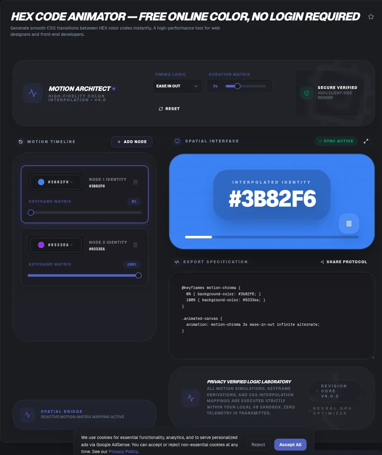
A hex code animator turns two static hex values into ready-to-paste CSS that moves smoothly from one color to the other. The Hex Code Animator at ToolSura does this entirely in your browser: enter a start color, an end color, and timing preferences, and it writes the @keyframes or transition code for you. No account, no upload, no waiting.
The privacy model matters more than most tutorials admit. Because the generator runs client-side, your palette never leaves your device; the tool page documents zero-knowledge architecture with no data transmission to servers. This guide explains how CSS color animation actually works, when you need @property, and how to keep the results fast, accessible, and on-brand.
Key Takeaways
- @property reached Baseline on July 9, 2024, so typed color animation works in every engine.
- Gradients never tween directly; register a typed custom property and animate that variable.
- Color changes are paint work, so keep looping gradients small or use opacity overlays.
- Wrap decorative loops in prefers-reduced-motion queries as recommended inclusive practice.
- The Hex Code Animator writes full snippets client-side, free, with nothing uploaded.
What Does a Hex Code Animator Do?
A hex code animator converts two hex endpoints into a complete CSS animation, usually an @keyframes block or a transition rule. The technique behind it went universal on July 9, 2024, when registered custom properties became Baseline Newly available, according to web.dev. ToolSura's version runs client-side and outputs copy-paste code in seconds.
The workflow is deliberately boring, which is the point. You supply a starting hex value, an ending hex value, and timing preferences; the tool assembles valid CSS you can paste into any stylesheet. Nothing installs, nothing builds, and the tool page documents that no hex codes, palettes, or snippets are stored server-side.
How Do You Animate Between Two Hex Colors in CSS?
The simplest path is a transition on a transitionable color property such as background-color. As MDN's transitions guide explains, transitions fire when a computed value changes, and the browser implicitly generates every intermediate frame between the old color and the new one.
.btn {
  background-color: #3b82f6;
  transition: background-color 0.4s ease;
}
.btn:hover {
  background-color: #ff6b35;
}
Transitions need a trigger: a hover, a class toggle, or a script-driven style change. Keyframe animations behave differently. They run from @keyframes rules and can loop on their own without any interaction, per the same MDN guide. Use transitions for reaction-based feedback and keyframes when a color should drift by itself.
Why Doesn't a CSS Gradient Animate on Its Own?
Gradients refuse to tween because the browser treats background-image as a discrete image rather than a numeric value, so transitioning it snaps instead of interpolating. The fix, demonstrated on MDN's @property page, is registering a typed custom property and animating that variable inside the gradient, which forces the gradient to recompute every frame.
MDN's own demo animates a registered --progress percentage from 25% to 100% over 2.5 seconds, sliding a linear-gradient stop smoothly. The same pattern works with a color-typed variable: register it, reference it with var() inside your gradient stops, and animate it in @keyframes. The generator automates exactly this plumbing for the hex pair you choose.
What Is @property and When Did Browsers Support It?
@property is a CSS at-rule that registers a custom property with a concrete type, an initial value, and inheritance behavior, and that typing is what makes the value animatable, per MDN. Support arrived in Chrome 85 and Edge 85 during August 2020, in Safari 16.4 during March 2023, and in Firefox 128 on July 9, 2024, per MDN's browser-compat data.
That Firefox release is the milestone: July 9, 2024 is when registered custom properties became Baseline Newly available, as tracked by the web-features explorer. The same tracker projects Widely available status around January 9, 2027, which is an estimate rather than a shipped milestone. No current engine requires flags or prefixes.
Inside the Generator: A Step-by-Step Walkthrough
The generator follows a four-step flow: choose a start hex, choose an end hex, set duration and easing, then copy the output. Because processing happens inside the browser's own JavaScript sandbox, results appear instantly, and the tool page documents that no data transmission to servers occurs anywhere in that flow.
- Sample both endpoint colors from your design so the animation matches real brand values.
- Set duration, easing, and iteration count; short values suit interactions, long values suit ambient loops.
- Copy the generated @keyframes block, plus the @property registration when gradients are involved.
- Paste into your stylesheet and confirm the timing in DevTools.
The output is plain CSS, so it works with any framework or preprocessor. And because nothing is uploaded, the page keeps working on a flaky connection once it has loaded.
Which Interpolation Space Should You Pick: sRGB or OKLCH?
The path your colors travel matters as much as the endpoints. CSS calculates gradient interpolation in the alpha-premultiplied color space, which prevents unexpected gray shades when colors and opacity change together, per MDN. Hue travel is a separate question: the legacy sRGB path can produce dark, desaturated midpoints that perceptual spaces avoid.
CSS Images Level 4, currently a W3C Working Draft dated September 30, 2025, adds a color-interpolation-method argument so you can write linear-gradient(in oklch, #0000ff, #ffff80) and interpolate along a perceptual path (W3C). Supported keywords cover rectangular spaces such as srgb, display-p3, and rec2020, polar spaces such as hsl and oklch, and four hue methods. The core interpolation rules live in CSS Color 4, a W3C Candidate Recommendation Draft published August 6, 2026 (W3C).
A blue-to-yellow ramp is the classic failure case for the older path: gamma-encoded sRGB was the only choice in CSS Images 3, and its midpoints run noticeably gray and dark. When your two hex values sit far apart on the color wheel, generate both variants and compare. The difference shows up most in the middle third of the animation, which is exactly where viewers look.
Does Animating Colors Hurt Performance?
Yes, relative to the cheapest properties, and the cost scales with painted area. Web.dev's standing guidance is to restrict animations to opacity and transform to stay on the compositor, and to avoid paint-triggering properties unless necessary (web.dev, last updated October 6, 2020). A color change repaints every frame; a transform usually does not.
Context decides severity. Repainting a button's background-color on hover touches a few thousand pixels and is imperceptible. Looping a full-viewport gradient repaints the whole screen at your refresh rate, which can jank on modest hardware. The same guide warns against reaching for will-change early in optimization, since it forces layer creation and suits only elements that are always about to change.
Measure rather than guess: record a trace in the Performance panel and check paint time per frame. If a looping gradient runs hot, shrink the animated surface, lengthen the duration, or switch to an opacity overlay, which the next section covers.
How Do You Respect Users Who Prefer Reduced Motion?
Wrap decorative animation in a prefers-reduced-motion media query that pauses it or swaps in a calmer effect. The media feature exposes the operating system's motion preference, and MDN warns that scaling or panning large objects can act as vestibular triggers (MDN); the feature has been Baseline widely available since January 2020.
@media (prefers-reduced-motion: reduce) {
  .glow { animation: none; }
}
The accessibility framing needs care. WCAG 2.2, a W3C Recommendation since December 12, 2024, defines Success Criterion 2.3.3 Animation from Interactions at Level AAA, and its definition of motion animation excludes color-only changes that do not alter perceived size, shape, or position (W3C). A pure hex cycle is therefore not a violation. Honoring the preference remains the inclusive practice that same W3C document recommends.
The audience for the courtesy is large. About 15 percent of American adults, 33 million people, had a balance or dizziness problem in 2008, per the NIH's NIDCD (page updated March 6, 2018). A peer-reviewed analysis of NHANES 2001-2004 data estimated that 35.4 percent of US adults aged 40 and over, about 69 million people, had vestibular dysfunction (Agrawal et al., via Europe PMC, May 2009). Both figures come from older survey windows, so read them as scale context rather than current prevalence.
While auditing motion, also confirm that text contrast holds at the animation's midpoint, since pairs that pass at both endpoints can fail in between.
What Durations and Easing Curves Work Best?
Interactive color feedback reads well between 150 and 500 milliseconds with ease or ease-out; ambient loops run far longer. For reference, the gradient-animator.com generator's own default is a 30-second, ease, infinite loop. Long cycles pair best with ease-in-out timing and the alternate direction so the loop never visibly snaps back to its start.
Match duration to meaning. A 200 millisecond hover tint reads as a response; a 4-second glow reads as atmosphere. For infinite cycles, set animation-direction: alternate so the return trip is animated instead of jumped, and stagger small delays across a card grid so elements pulse in sequence rather than in lockstep.
Can You Animate a Conic Gradient Angle in CSS?
Yes. Register an angle-typed property, then animate it inside the conic gradient, and every engine that supports @property will interpolate the angle smoothly. Notably, MDN's @property reference does not include a conic-angle demo, so this recipe is worth keeping in your snippet file.
@property --turn {
  syntax: "<angle>";
  inherits: false;
  initial-value: 0deg;
}
.pie {
  background: conic-gradient(from var(--turn), #3b82f6, #ec4899);
  animation: spin 6s linear infinite;
}
@keyframes spin { to { --turn: 360deg; } }
The registered-type trick generalizes: percentage types drive progress bars and gradient stops, color types drive endpoints, and angle types drive rotation. If a value refuses to animate, the usual culprit is a missing or mistyped syntax descriptor, because unregistered custom properties flip discretely instead of interpolating continuously.
Should You Animate an Overlay's Opacity or the Real Color?
Choose based on what the animation must prove. Opacity overlays stay on the compositor, so playback stays smooth, but they blend toward one fixed color. Animating background-color or a registered color variable gives true point-A-to-point-B interpolation between your chosen hex values, at the cost of per-frame paint (web.dev).
A hybrid often wins: put a static gradient on a pseudo-element and animate only its opacity from 0 to 1. You keep compositor smoothness and still get a two-color effect, provided one endpoint may stay constant. When both endpoints must be exact hex values, accept the repaint and keep the surface small.
What Do Competitor Generators Miss?
The popular generators leave four gaps: no two-hex workflow, no reduced-motion output, no interpolation-space choice, and no published privacy posture. Gradient-animator.com animates background-position with an oversized background, Animista applies preset animation classes, and cssgradient.io builds static gradients only. None of these tool pages states a privacy or client-side processing claim.
To be precise about the hedge: nothing here suggests those tools mishandle data; they simply do not publish a client-side claim the way ToolSura's page does when it documents zero-knowledge architecture and no data transmission to servers. The functional gaps are concrete. None takes a start hex and an end hex and emits a complete @keyframes block for that pair, none emits a prefers-reduced-motion variant alongside the animation, and none exposes CSS Images 4 interpolation methods.
Demand for color motion is easy to quantify anyway. The gsap library recorded 4,637,059 downloads and animejs recorded 1,139,631 downloads for the week of August 16 to 22, 2026, per the npm registry API and its animejs endpoint. Those counts proxy demand for animation libraries in general, not CSS generators specifically, but they show how much tweening still ships through JavaScript that plain CSS now handles.
Five Patterns for Animated Hex Colors
Five patterns cover most real uses: hover tints, loading pulses, ambient hero backgrounds, status indicators that breathe between safe and warning colors, and glow effects synced with shadows. For the glow case, pair the color loop with a matching box shadow so the light source reads as one element instead of two unrelated effects.
Status color animation deserves one guardrail: never communicate state by hue alone. Add an icon, label, or shape so the meaning survives grayscale rendering and color-vision deficiencies, and keep the animated surface away from body text so readability never depends on a mid-transition frame.
Where Animation Fits in a Color Workflow
Color animation is the last mile, not the whole journey. A sensible pipeline runs: pick endpoints with a palette tool, build the static gradient, convert hex to RGB when alpha is needed, verify contrast, then animate. Each step has a dedicated browser-based tool, and the animation generator slots in at the end.
Keeping that pipeline client-side matters for the same privacy reasons as before, since color choices often encode brand direction before launch. When a generator documents client-side processing, as this one does, you can experiment freely without drafts touching a server.
The Bottom Line
Front-end developers who need a specific hex-to-hex animation right now are the core audience, and the zero-upload architecture makes the tool safe for unreleased brand work. The technique is Baseline across every major browser, the output is plain CSS with no dependencies, and the price is free. Paste two colors and ship.
Related Tools
Building an animated color effect usually touches a few neighboring jobs. Pick endpoints with the color picker and palette generator, build the static gradient first with the CSS gradient generator, convert endpoints to RGBA with the hex to RGB converter when you need alpha, confirm readability with the color contrast checker, match a glow with the CSS box shadow generator, and trace interpolation paths in the 3D color cube visualizer. When the endpoints are settled, head back to the Hex Code Animator and generate the keyframes.