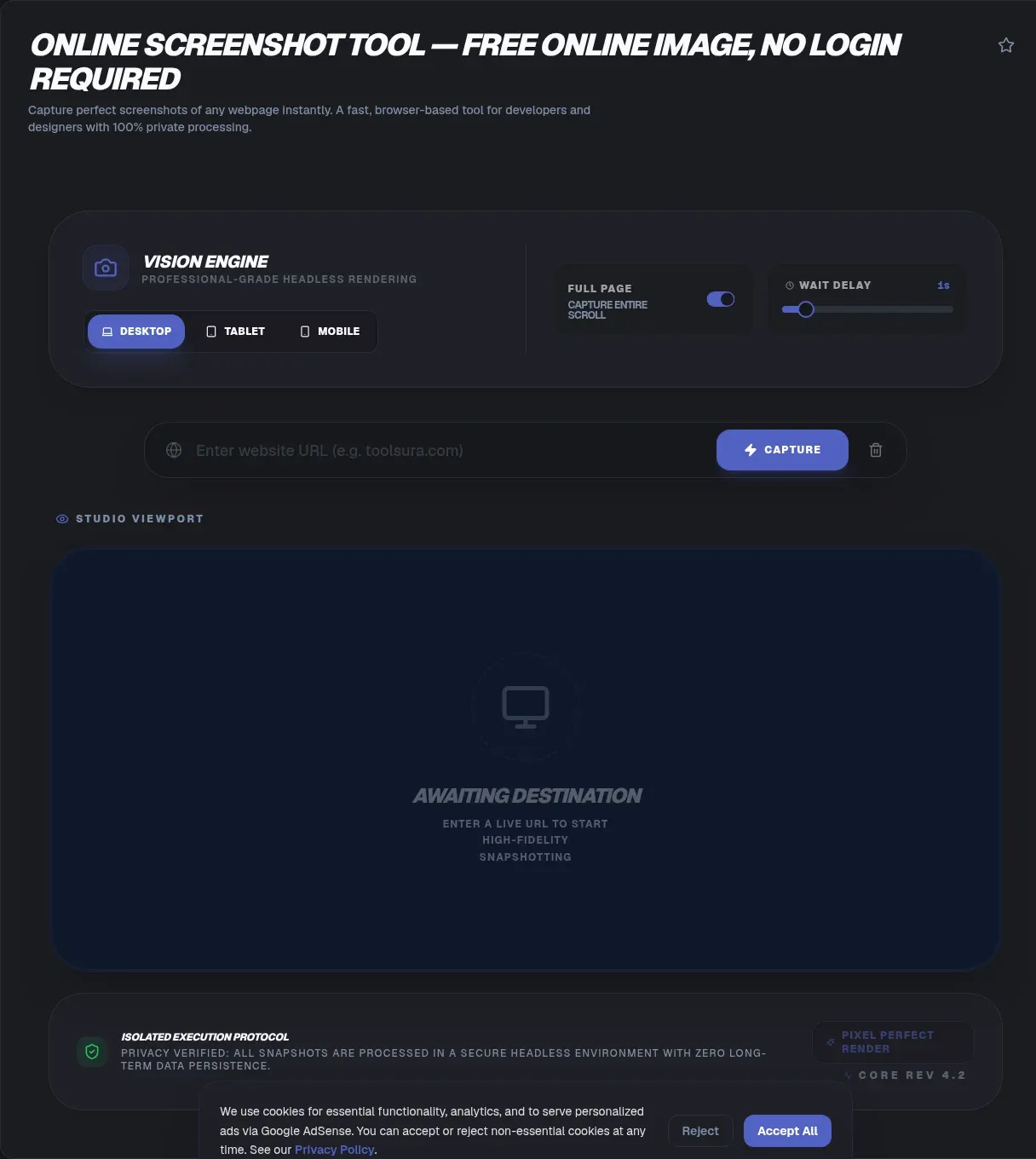
ToolSura's online screenshot tool captures any web page as a PNG, JPEG, or WebP image, right in your browser, with no upload, no signup, and no server in the loop. You paste a URL, pick a format and viewport, and the page renders on your device, where it stays. The render never leaves your machine, which is the whole point: a screenshot is the only trace the tool ever produces, and you keep it.
Key Takeaways
- Renders full-page screenshots in your browser — your URL never uploads
- Supports PNG, JPEG, WebP with desktop, tablet, and mobile viewports
- Retina scaling (2x) doubles pixel dimensions for crisp captures
- Works offline after first load; no account or API key required
People use screenshot tools for ordinary, practical jobs: capturing a competitor's landing page, snapping a bug state for a developer, saving a design reference before a site changes. Most free screenshot sites take the easy path. Your URL goes to their server, the server renders it, and an image comes back. The W3C Referrer Policy warns that full URLs in the Referer header can reveal a visitor's identity, and that's exactly the traffic those services collect. ToolSura inverts the model: the rendering engine ships to your browser, works offline, and your URL never reaches a third-party server.
TL;DR: ToolSura's free website screenshot tool renders any URL to PNG, JPEG, or WebP entirely client-side, using your browser's own engine, so nothing uploads and no account is needed. Pick desktop, tablet, or mobile viewports, set retina scaling, and download the capture. Read on for format math, viewport sizes, real use cases, and the honest limits.
What Is a Website Screenshot Tool?
A website screenshot tool renders a URL exactly as a browser would and saves the result as an image file. The technique is standardized: the W3C WebDriver spec defines a Take Screenshot command that returns the visible viewport as PNG, and headless browsers have automated it since Chrome 59 shipped in April 2017.
Under the hood, the process mirrors what your tab does every time you load a page. The engine parses HTML and CSS, runs the page's JavaScript, builds a render tree, lays out the page, and paints pixels to a frame, the pipeline MDN documents as the critical rendering path. A screenshot tool simply freezes that frame at a chosen moment and encodes it to a file.
A headless browser is the classic implementation: a full browser without a window, driven by automation libraries. Puppeteer's Page.screenshot() is the canonical example, and it powers most cloud screenshot APIs. This tool runs the same job with a different approach. It renders the page inside your own browser tab, then captures the result. No second engine, no extra trip to a server.
Full-page capture works by widening the render window to the page's full scroll height before capturing, or by scrolling and stitching frames. Either way, you get the page as a first-time visitor would have seen it, minus what hides behind interaction.
Why ToolSura's Online Screenshot Tool Is Different
Most free screenshot sites are thin skins over a server: you paste a URL, the site uploads it, a cloud browser renders it, and an image returns. ToolSura's online screenshot tool does all of that in your browser instead, so the URL never leaves your device, and no account or API key ever exists, matching GDPR Article 25's privacy-by-design principle.
The URL itself is the privacy leak. A URL can carry a username, a document name, a campaign token, or an identifier tied to you, and the W3C Referrer Policy is explicit that full URLs "might reveal the identity of the owner of the profile." Cloud screenshot services collect that traffic by design, because their business model is rendering on demand. This tool has no server to send it to.
Friction is the second difference. Cloud APIs like browserless.io are powerful, but they start with credentials and billing. ToolSura's tool starts with a URL box. No signup, no API key, and nothing to mind but the page load itself. Once the page is loaded, there's no network at all, so it keeps working in a hotel lobby or on a plane.
There's also a rendering edge. The engine here is the browser you're already using, and Chromium engines power about 77.5% of global browsing, with Chrome alone at 68.22%. The capture matches what most of your visitors actually see, in the engine they actually use.
| Cloud screenshot API | ToolSura in-browser tool | |
|---|---|---|
| Where your URL goes | Uploaded to a server | Stays on your device |
| Account or API key | Usually required | None |
| Works offline | No | Yes, after first load |
| Render engine | Server-side browser farm | Your browser |
How to Use the Online Screenshot Tool
The whole flow takes under a minute, and every step happens on your device. Paste a URL, pick a format, choose a viewport, set the scale, capture. That's the entire interface, and there's nothing to install, register, or pay for.
- Paste the URL: Include the scheme, so https://example.com rather than example.com. This tells the tool where to render.
- Choose the format: PNG keeps text and UI pixel-perfect. JPEG cuts size on photo-heavy pages. WebP gets closest to JPEG size with PNG-like quality.
- Pick a viewport: Desktop, tablet, or mobile. The page renders at that width, exactly like resizing a window.
- Set the scale factor: Leave it at 1 for standard output, or set it to 2 for retina, which doubles the pixel dimensions of the result.
- Capture and download: Click Capture, wait a few seconds while the page renders, then download the image. Re-capture with different settings anytime.
A few seconds is normal for a first capture, since the page's CSS and scripts all load inside the render. If a capture crawls, that's data, too. In our captures, a 10-second render is always a 10-second page, not a broken tool.
Website Screenshots: PNG vs JPEG vs WebP
Format choice is a file-size math problem, and the numbers favor WebP. Google's own measurements show lossy WebP is 25-34% smaller than JPEG at the same visual quality, while lossless WebP runs 26% smaller than PNG. Since images make up about 37% of the median desktop page's weight, 1,058 KB of the typical 2,862 KB page, format choice is the biggest lever you control.
When to pick each one depends on what the screenshot contains. PNG is lossless, which makes it right for text, UI elements, logos, and anything with sharp edges, because no compression artifact blurs them. The cost is bytes: a full-page PNG of a busy site can run several megabytes.
JPEG trades sharpness for size. On a page made of photos and gradients, the eye barely notices the artifacts, and the file shrinks dramatically. For a dashboard or a code block, JPEG is the wrong tool: text goes smudgy around the edges.
WebP is the modern default. Google standardized it as RFC 9649 in November 2024, and browser support now covers roughly 97% of the market. You get JPEG-like sizes with fewer artifacts, and the lossless variant beats PNG on weight. That's why WebP is the pragmatic pick for anything headed into email, wikis, or docs, where every kilobyte counts.
| Format | Best for | Watch out for |
|---|---|---|
| PNG | Text, UI, logos, design reference | Large files |
| JPEG | Photo-heavy, gradient-heavy pages | Artifacts on text |
| WebP | Most captures, sharing, docs | Older tooling |
For documentation screenshots specifically, WebP lossless around quality 80 is a reasonable starting point: text stays sharp while the file drops noticeably against PNG. Quality is a dial, so re-encode and compare if the text looks soft.
Viewport Sizes and Resolution: Desktop, Mobile, and Retina
Desktop screenshots should target 1920x1080, the world's most common desktop resolution at 22.41% of Statcounter's measured traffic, while mobile captures are best framed at 360-414px wide, since 414x896 leads mobile at 13.24%. The viewport you pick changes how the page lays out, not just how big the image is.
That second part is the subtle one. Mobile browsers default to a virtual viewport of about 980px and shrink it to fit the screen. Only a viewport meta tag unlocks true responsive layout.
So a page captured at mobile width lays out differently from the desktop version: the menu collapses, columns stack, and images resize to fit. That's the difference between a mobile screenshot and a shrunken desktop screenshot.
Resolution is separate from layout. The device scale factor, devicePixelRatio in CSS terms, is how retina screens pack more physical pixels per CSS pixel. A 390px viewport at a scale factor of 2 renders as 780 physical pixels wide, which is exactly what the output dimensions reflect. A "mobile" capture can come out 780 pixels wide without changing the layout: the layout is mobile, the resolution is retina.
Desktop viewport at scale factor 1 gives 1920x1080 output, the standard full-HD frame. Mobile viewport at scale factor 2 gives a retina-grade capture that stays crisp on a phone screen and survives zooming inside a bug report.
The same physical pixel count can represent two completely different layouts. A 780px wide image could be a 390px mobile viewport at 2x, or a 780px desktop viewport at 1x — the content differs entirely.
Real-World Uses for Website Screenshots
Screenshots are the fastest documentation and diagnostic tool on the web, and they cluster into six distinct jobs. Competitive analysis, bug reports, documentation, link previews, visual regression testing, and speed screening, each with a best-practice size and a repeatable workflow.
Competitive analysis: Capture a competitor's homepage weekly and you can watch messaging, pricing, and layout drift in real time. Use the same viewport every time, desktop and mobile, so the series compares like for like.
Bug reports: A screenshot of the broken state is the most valuable thing you can attach to an issue, because it captures what code alone can't show. Include the URL and viewport in the report, and the reproduction steps become obvious.
Documentation and tutorials: Step-by-step guides live or die on accurate captures. Capture at a consistent width, the desktop viewport or 1200px, so screenshots sit comfortably in a docs layout, and re-capture whenever the UI changes.
Social and link previews: When a link is shared, platforms pull the page's og:image, and the Open Graph protocol recommends 1200x630. Capture the page you want to feature and produce a card at that ratio, and previews stop coming out as gray boxes or badly cropped surprises.
Visual regression testing: Teams screenshot a page, store it as a baseline, and diff every deploy against it, catching layout shifts no unit test sees. BrowserStack's guide to visual regression testing frames it as catching when "the feature works, but the experience feels broken." ToolSura's captures make handy baseline source material.
Speed screening: Rendering takes as long as the page takes, so a slow capture is a signal. If the tool sits on a blank screen for 10 seconds, visitors pay that same tax, and the payoff for fixing it is real: the BBC lost 10% of users for every extra second of load time. Compare your capture time against Google's Core Web Vitals thresholds, LCP under 2.5 seconds and INP under 200ms, and note that only 48% of mobile sites pass all three, per the 2025 Web Almanac.
Why ToolSura's Tool Captures Some Pages Better Than Others
No online screenshot tool, this one included, can capture every page, and the honest list of exceptions is short and technical. Login-gated pages, paywalls, and canvas-heavy pages each block capture for a specific reason, not out of stubbornness.
Login-gated pages and paywalls: The tool renders what a first-time visitor sees. Your session cookies, and the authenticated state behind them, live in your browser and never reach the render. A dashboard behind SSO, a paywalled article, or a private app captures as its logged-out version, if it captures at all. It's a privacy feature: the tool can't be used to peek past other people's logins.
Canvas-tainted pages: Some pages draw content from another origin into a canvas, and browsers lock that canvas down. MDN's CORS-enabled image reference explains the rule: without CORS approval from the other origin, the canvas is "tainted," and reading its pixels, via toDataURL, toBlob, or getImageData, throws a SecurityError. A tainted canvas captures as blank or fails outright.
Everything else behaves: Static pages, marketing sites, blogs, and single-page apps all capture faithfully, because in-browser rendering runs the page's own JavaScript. Content that lazy-loads or renders on scroll settles into the capture. If a page hides content behind auth, the honest answer is that no tool can screenshot it for you.
Trust and honest limits: Tools that promise every page, every time are sending your URL to a server that's already logged in, or ignoring the canvas problem. ToolSura's tool would rather be honest: it captures what a first-time visitor sees, and says so.
Key Takeaways
- Pages render to PNG, JPEG, or WebP entirely inside your tab with no server involved
- Desktop, tablet, and mobile presets cover everything from 1920 by 1080 down to roughly 360 pixel widths
- Retina scaling doubles output dimensions, so a 390 pixel viewport exports 780 pixels wide
- Full-page capture widens the render window or stitches scrolled frames into one tall image
- Honest limits: login walls show their logged-out state, and tainted canvases refuse to export
Related Tools
ToolSura's screenshot tool pairs naturally with the rest of the suite. Check the contrast of anything you capture with the Color Contrast Checker, the accessibility half of visual review. Ship a capture as a data URI instead of a file with the Base64 Image Encoder, handy for inline images in email and markdown. Pull the text out of a captured page with the Image to Text OCR, which also runs entirely in your browser. When a design asset needs to change formats, the SVG to PNG Converter handles vector-to-raster conversion without a design app. Trim the weight of anything you capture with the PNG JPG Image Compressor, and inspect exactly what a screenshot carries using the Image Metadata Viewer.
For saving full pages as documents, the HTML to PDF tool converts any URL to a portable PDF. Add notes to your captures with the PDF Annotator. See how ToolSura compares to other tools in the CodeBeautify Alternative guide. For debugging redirect chains on captured pages, the Redirect Chain Guide walks through the process.
Capture, convert, compress, inspect: ToolSura's Online Screenshot Tool anchors a visual workflow that never sends your pages to a server.