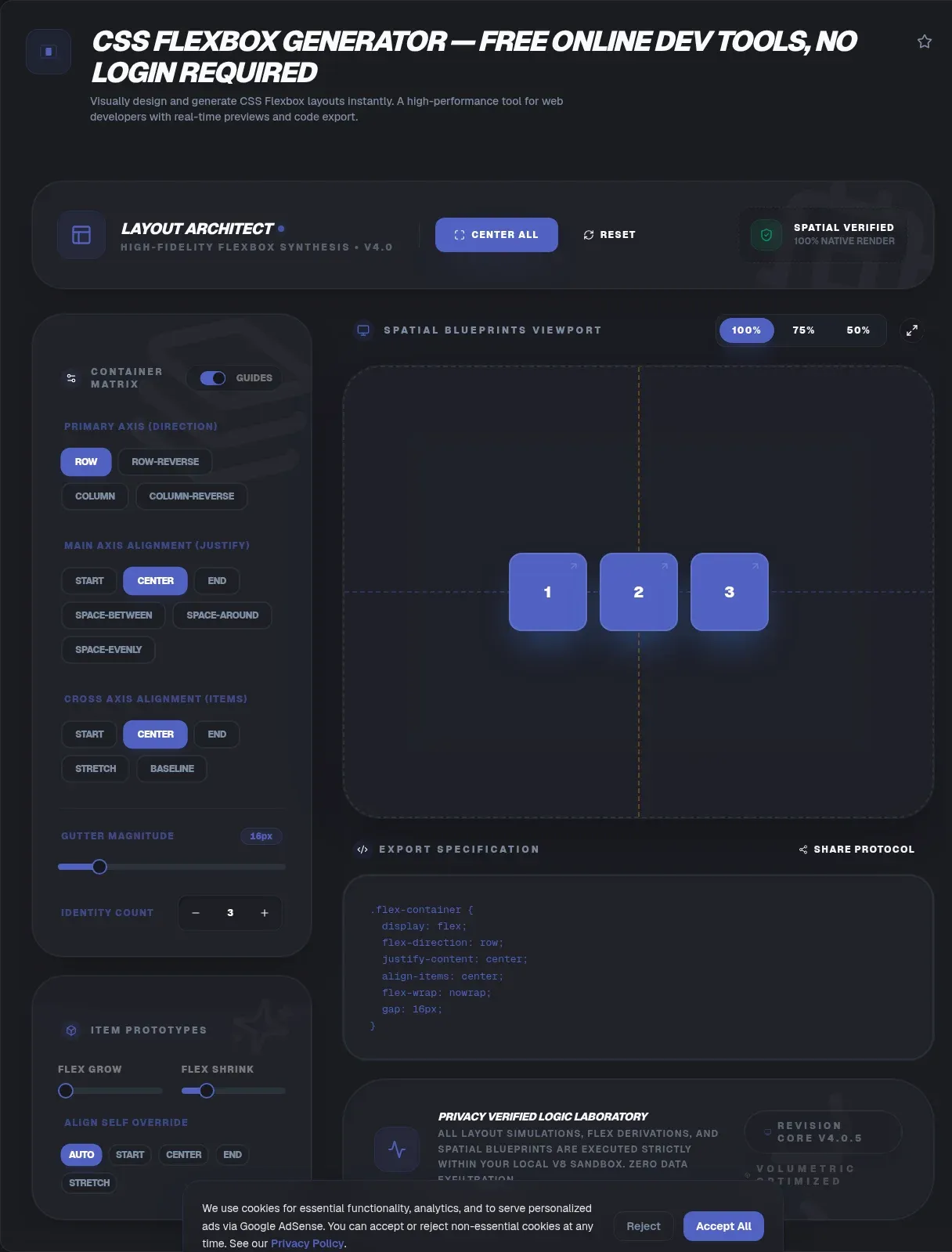
Flexbox demos look effortless in tutorials, then fall apart in real projects: images stretch without permission, buttons refuse to center, and one long label shoves everything sideways. A CSS flexbox generator replaces that guessing game with sliders and instant feedback. The ToolSura version runs entirely in your browser, so every experiment stays local from the first click.
That privacy story holds up under inspection, because nothing is uploaded while you tune properties, matching the page's zero-knowledge architecture claims. This guide walks through how the tool works, what each controlled property actually does, the gotchas that quietly break layouts, and a simple framework for choosing between flexbox and grid.
Key Takeaways
- Flexbox shipped on 74% of mobile pages as of the 2022 HTTP Archive crawl, so the skill compounds yearly.
- A generator converts control tweaks into copy-ready CSS with a live preview beside you.
- justify-content aligns the main axis; align-items handles the cross axis and stretches by default.
- Three traps bite hardest: min-width floors, percentage heights, and overflow with wrapping disabled.
- Move to grid when wrapped rows must line up across columns.
What Is a CSS Flexbox Generator?
A CSS flexbox generator is a visual editor that translates clicks into working flex declarations. You set container behavior, item flexibility, and alignment through interactive controls, sliders, and dropdowns, then copy the emitted CSS straight into your stylesheet. The demand is easy to explain: flexbox appeared on 74% of mobile pages as of the 2022 HTTP Archive crawl (Web Almanac).
The learning payoff rivals the speed gain. Because a preview reacts to every change, you connect flex-direction to visible outcomes in minutes instead of memorizing tables. Beginners use generators to internalize alignment logic, while experienced developers test awkward combinations before touching production stylesheets. Either way, the feedback loop beats edit, save, and refresh cycles on repeat.
How Does Flexbox Work? Meet the Two Axes
Every flexbox decision starts with two axes. The main axis follows flex-direction, and the cross axis runs perpendicular to it (MDN Web Docs). Set direction to row and items flow horizontally in English; switch to column and the main axis rotates vertical, dragging every alignment property along with it.
The four direction values are row, row-reverse, column, and column-reverse. Start and end edges respect writing modes too, so an Arabic page flows its main axis from the right without extra code. That detail trips up developers who hardcode left and right assumptions, and it is one more argument for previewing layouts visually before anything ships.
Why Reach for a Generator Instead of Hand-Written CSS?
Some flexbox corners remain obscure even for veterans. flex-basis: content, which sizes an item from its intrinsic content, showed up on just 0.5% of mobile sites as of the 2022 HTTP Archive crawl, and 0.6% on desktop (Web Almanac). When rarely used values behave counterintuitively, seeing them beats recalling them.
Generators also compress debugging time. Suspect that space-between is stretching a header? Toggle one dropdown and the preview confirms or clears the suspicion in seconds. Hand-testing the same hypothesis means editing a stylesheet, saving, switching tabs, and reloading, multiplied by however many candidate values you need to eliminate.
How Does the ToolSura CSS Flexbox Generator Work?
Three steps cover the whole workflow. First pick container settings: display, flex-direction, justify-content, align-items, and flex-wrap. Next shape item behavior with flex-grow, flex-shrink, and flex-basis. The live preview updates in real time throughout, and per the page, the resulting CSS is yours to copy and paste directly into your stylesheet.
Privacy claims sit front and center: a Verified 100% Client-Side badge, a Processing Mode listing a 100% Client-Side V8 Sandbox, and zero-knowledge architecture language promising no data transmission to servers. The page has been active since 2024 and displays a high verified trust score. For agency code under NDA, that design removes an entire category of questions.
Once a snippet lands in your project, slim it with the rest of your assets using the HTML, CSS & JS Minifier before deployment day arrives.
Which justify-content Value Fits Your Layout?
justify-content spreads items along the main axis, and its default is flex-start (MDN Web Docs). Five values appear on the ToolSura page, and each distributes leftover space differently. The table summarizes the practical differences so you can stop cycling through options blindly.
| Value | Where spare space goes | Typical job |
|---|---|---|
| flex-start | Packed at main-end | Default reading flow, leading-aligned rows |
| flex-end | Packed at main-start | Trailing actions, end-weighted bars |
| center | Split evenly on both sides | Centering logos and hero content |
| space-between | Between items only | Navbars with logo left, links right |
| space-around | Between items, half-size spaces at ends | Card rows that breathe gently |
One footnote keeps you accurate: MDN also documents space-evenly, which places identical spacing at the edges and between items, though the ToolSura page lists the five values above. The related justify-items property is ignored in flex layouts, so this single property owns main-axis distribution entirely.
What Do align-items and align-self Control?
align-items works across the cross axis, and its default stretch explains a classic surprise: children grow to their container's height without anyone asking (MDN Web Docs). The option list covers flex-start, flex-end, center, stretch, and baseline, with baseline lining items up by their text baselines rather than their boxes.
Need a per-item exception? align-self overrides the container's choice for one child, and align-content only matters once wrapping produces multiple stacked lines. Combine both axes at once with place-content if you enjoy dense shorthand. In practice, stretch plus occasional center covers most interfaces, and baseline earns its keep in mixed-typography rows.
How Does flex-wrap Reshape a Row?
By default flexbox refuses to wrap. Items compress toward their minimum size as space runs out, then overflow the container once compression hits the floor (MDN Web Docs). Switch on flex-wrap and extra items drop to a fresh line instead, with wrap-reverse flipping the stacking direction when a design calls for it.
Wrapped layouts deserve one caution from the same guide: treat each line as its own flex container. Alignment decisions restart per line, which is why long card grids built on flex tend to drift out of column. The responsive upside is real, though. Paired with sensible flex-basis values, wrap yields multi-row layouts without a single media query, echoing the quick responsive-grid technique the tool page recommends.
What Does flex: 1 Actually Mean?
Longhand defaults are quiet: flex-grow 0, flex-shrink 1, flex-basis auto. The shorthand rewrites two of them when omitted, so flex: 1 expands to 1 1 0% rather than 1 1 auto (MDN Web Docs). That missing auto changes everything downstream, as the table shows.
| Declaration | Expands to | Practical meaning |
|---|---|---|
| flex: initial | 0 1 auto | Never grows, may shrink |
| flex: auto | 1 1 auto | Fully flexible from content size |
| flex: none | 0 0 auto | Completely rigid |
| flex: 1 | 1 1 0% | Equal widths among siblings |
| flex: 2 | 2 1 0% | Double the share of flex: 1 neighbors |
Here is the nuance worth remembering. flex: 1 sets basis to 0%, so content size stops mattering and siblings split space equally. Write flex: 1 1 auto and growth starts from each item's own content size, letting the longest item stay dominant. The Holy Grail layout recipe on the tool page leans on exactly this kind of grow and shrink tuning.
Should You Space Items with gap or Margins?
gap draws uniform gutters between flex items and between flex lines, and it deliberately stops at the edges: there is no gutter before the first item or after the last (MDN Web Docs). Its initial value, normal, behaves like zero inside flex containers, so untouched layouts show no phantom spacing.
Margins play a different role. They stack on top of gap, so visible separation can exceed the gap you set, and they handle edge spacing plus asymmetric pushes. The classic trick is margin-left: auto on one item, which shoves everything after it toward the far end because auto margins swallow all the spare space on their axis, standing in for the justify-self that flexbox lacks (MDN Web Docs).
Why Is My Flex Item Overflowing? Three Classic Gotchas
Overflow usually traces to the automatic minimum size rule. Flex items refuse to shrink below a floor derived from min-content unless they are scroll containers, per section 4.5, Automatic Minimum Size of Flex Items, of the CSS Flexible Box Layout spec (W3C CSSWG), and MDN's min-width reference describes the same behavior (MDN Web Docs). The standard remedy is min-width: 0.
Percentage heights fail differently. When a parent's height depends on its content, a child's percentage height computes to auto instead of a fraction, per MDN's height documentation (MDN Web Docs). Give the ancestor chain an explicit height, or lean on stretch, and the arithmetic starts working again.
Third, remember the nowrap overflow from earlier: compression bottoms out and content spills past the edge. Diagnose in order, minimum floor, then height chain, then wrap mode, and most mystery overflows resolve in a single pass. The generator's preview reproduces each failure locally, so you can prove the fix before editing production files.
Flexbox or Grid: Which Deserves This Element?
Flexbox handles one dimension while grid handles two, as MDN's comparison puts it plainly (MDN Web Docs). Card rows that must align column-to-column across every wrapped line belong to grid; toolbars, navbars, and single-axis stacks belong to flex.
There are no size-based rules saying small components get flexbox while large screens get grid, the same guide stresses. Grid sizes its tracks from the container inward, while flexbox sizes the items themselves. If you catch yourself setting widths purely to fake column alignment in a wrapped flex row, treat that as your signal to switch, and the CSS Grid Layout Generator makes the migration painless.
How Widespread Is Flexbox?
Adoption climbed steadily across four consecutive crawls. As of the 2022 HTTP Archive crawl, flexbox rendered on 74% of mobile pages, up from 49% in 2019, while grid rose from 2% to 12% across the same window (Web Almanac).
| Mobile crawl year | Flexbox pages | Grid pages |
|---|---|---|
| 2019 | 49% | 2% |
| 2020 | 63% | 5% |
| 2021 | 71% | 8% |
| 2022 | 74% | 12% |
Property-level data fills in the backstory. The flex declaration appears somewhere in stylesheets on 77% of pages, and legacy 2009-era display: box syntax survives on 51%, most likely injected for backwards compatibility by a tool such as Autoprefixer (Web Almanac). Exotic corners stay exotic, with flex-basis: content still under 1% on both device classes.
Browser context rounds out the picture: flexbox is Baseline Widely available, per MDN available across browsers since September 2015 (MDN Web Docs). Projects supporting truly old environments may still ship prefixed declarations, which matches the vendor-prefix hedge on the tool page's FAQ.
Does Reordering Items Break Accessibility?
It can. The order property moves items visually without touching the DOM, and MDN warns outright that the disconnect between visual presentation and document order adversely affects low vision users navigating with screen readers (MDN Web Docs). Keyboard focus follows markup, not pixels, so tab order stays behind while eyes move ahead.
Safer habits cost little. Fix the source order in your HTML whenever possible, reserve order for purely cosmetic swaps, and test keyboard traversal after any rearrangement. Worth noting: none of the four generator competitors reviewed below surfaces this warning, making it an easy discipline to adopt ahead of the crowd.
How Do Other Flexbox Generators Compare?
Four established alternatives earned a close look, judged on visible features only. flexbox.help tests flexbox rules with a child count from 1 to 8, container controls, MDN detail links, and a copy button, though item-level grow and basis controls are absent from its documented feature set (flexbox.help).
Flexy Boxes presents itself as a flexbox playground and code generator, offering container plus per-item controls for order, flex, and align-self, an RTL toggle, and output in vanilla, -webkit-, and legacy forms aimed at old-spec targets (Flexy Boxes). Its positioning leans on dated browser support tables.
CSS Portal combines numeric gap input, click-to-edit items, plain-English explanations, live warnings such as align-content requiring wrap, and a quick-reference cheat sheet, all wrapped in a cluttered, donation-heavy interface (CSS Portal). FlexBoxGenerator.com provides direction, justify, align, and wrap controls, per-item grow up to 5, basis presets, an item counter, live preview, and 18-plus real examples, free with no account (FlexBoxGenerator.com).
Against that field, the ToolSura page stakes out a distinct corner: verified 100% client-side processing, zero-knowledge messaging, no login requirement, and a full companion suite one tab away. Feature comparisons matter, yet knowing precisely where your code runs is the differentiator this page chooses to lead with.
Wrapping Up
Flexbox rewards structured experimentation. Once the two axes feel intuitive, shorthand quirks like flex: 1 versus 1 1 auto stop surprising you, and classic failure modes become ten-second diagnoses instead of afternoon mysteries. The adoption numbers say the effort compounds, and the accessibility caveats say to apply it thoughtfully.
Open the CSS Flexbox Generator, drag the controls until the preview matches the picture in your head, and copy the result into your stylesheet. Your layouts get production-grade declarations, your understanding gets a permanent upgrade, and neither ever has to leave your machine.
Related Tools
Round out your front-end toolkit with these companions, each free and browser-based:
- CSS Grid Layout Generator: the two-dimensional counterpart for track-based layouts.
- CSS Gradient Generator: paint backgrounds behind your flex components.
- CSS Box Shadow Generator: add depth cues that complement flexible spacing.
- HTML, CSS & JS Minifier: slim every stylesheet your layouts ship in.
- Color Picker & Palette Generator: lock brand colors before styling components.
- CSS Minifier: a focused alternative for CSS-only optimization.
- Flexbox vs Grid — when to reach for each layout system
When the next layout question strikes, bring it back to the CSS Flexbox Generator and answer it visually in seconds.