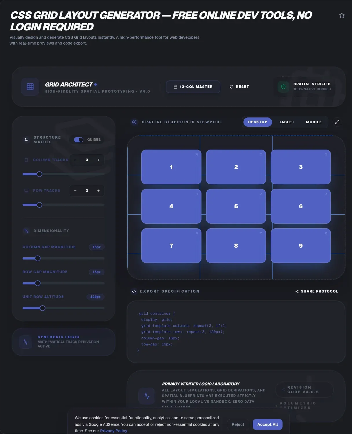
The ToolSura CSS Grid Layout Generator lets you draw a two-dimensional layout in your browser and walk away with the code. Define columns, rows, and gaps with visual controls, drag across cells to name regions like header, sidebar, and main, then copy production-ready CSS and HTML generated instantly from your design Source.
Everything runs locally. The page describes processing as fully client side inside a browser sandbox with no data transmission to servers, no signup requirement, and unlimited designs on the free tier Source.
What Makes Grid Different
MDN defines the model plainly: "CSS grid layout introduces a two-dimensional grid system to CSS," usable for "major page areas or small user interface elements" alike Source. Two-dimensional is the operative phrase: you control rows and columns simultaneously, so an element can be pinned to a specific intersection of both.
That is precisely what one-axis layout systems cannot express directly. When your dashboard needs a fixed-height header, a flexible middle band, and a pinned footer while columns stay aligned through all three, grid describes the whole plane in one declaration instead of stacked single-axis containers fighting each other.
The Vocabulary of Grid
| Term | Meaning |
|---|---|
| Grid container | Element with display: grid; its direct children become grid items |
| Track | Space between two adjacent lines (a row or column) |
| Line | Numbered boundary used for placement; line 1 sits at the writing-mode start |
| Cell | Smallest unit, conceptually like a table cell |
| Area | Rectangular region spanning multiple cells |
Two rules from MDN surprise people most often Source. Areas must be rectangular: "it isn't possible to create an L-shaped area." And lines are numbered by writing mode, so in left-to-right documents line 1 starts at the left edge, which matters when localizing layouts.
How This Generator Works
The workflow documented on the tool page mirrors how designers already think. Set row and column counts using pixels, percentages, or fr units; adjust row-gap and column-gap values from the sidebar; then click and drag across multiple cells to define and name specific layout regions for headers, sidebars, and content zones Source.
Individual items can also be placed visually, and fractional-unit behavior updates in real time as you tweak values. When the arrangement looks right, the generator outputs both stylesheet rules and matching HTML markup, so the pasted result renders identically to the preview without hand-translating between the two files.
Named Areas Without the Guesswork
Grid template areas are the feature that makes layouts self-documenting: you write an ASCII-style map where each token names a region, repeated across the cells it spans. Done by hand, counting quotes and periods gets error-prone fast; done visually here, dragging across cells generates correct area syntax automatically per the tool's FAQ Source.
The dashboard use case shows why this matters. A typical admin screen combines a top bar, a navigation rail, a scrollable main region, and maybe a stats strip. With named areas the final CSS reads almost like the wireframe, and teammates reviewing the code can see the intended geometry without opening a renderer.
The fr Unit Explained
MDN introduces fr as "a fraction of the available space in the grid container" Source. Declare grid-template-columns: 1fr 2fr and the second column always receives twice the leftover space of the first, whatever the viewport does. Equal values share equally; mixed units blend fixed and fluid behavior.
This is also where the generator's real-time visualization earns attention: watching tracks redistribute as you change fr values builds intuition faster than any prose explanation. Responsive behavior falls out naturally too, since fraction-based columns scale with the container, which is exactly how the tool's FAQ suggests achieving layouts that adapt without media queries Source.
Gap Behavior Worth Knowing
Gutters come from column-gap, row-gap, or the shorthand gap, but MDN documents a subtlety most tutorials skip: "any space used by gaps will be accounted for before space is assigned to the flexible length fr tracks" Source. Gaps consume budget first; fractions divide whatever remains.
Gaps also behave like "a thick, transparent line": nothing can be placed inside them. If a design seems to need content straddling a gutter, that is a signal to add a track rather than fight the gap model. The generator's pixel- and percentage-based gap controls make these adjustments visual rather than arithmetic.
Explicit and Implicit Grids
Tracks declared through grid-template-columns and grid-template-rows form the explicit grid. Place something outside those bounds and the implicit grid extends automatically, with auto-sized tracks by default Source. Implicit growth is convenient during prototyping and occasionally surprising in production.
When items appear outside your intended frame, check whether placement references lines beyond the explicit definition. The generator keeps you inside declared tracks while you design, which quietly prevents the most common implicit-grid surprises before they reach stylesheets.
Adoption and Browser Support
Grid's rise is measurable. In the Web Almanac 2022 CSS chapter, published September 26, 2022, grid usage climbed from 2 percent of mobile pages in 2019 to 12 percent in 2022, part of a broader layout-system adoption wave in which flexbox reached 74 percent over the same period Source. Those are crawl-labeled figures from the HTTP Archive, not current measurements.
On compatibility, the tool page states modern browsers fully support the relevant properties across Chrome, Firefox, Safari, and Edge, recommending feature queries or autoprefixing for older environments Source. That guidance matches the practical reality of shipping: modern baselines are safe, legacy support is a build-configuration decision.
Subgrid and Overlap
Two advanced capabilities extend the model. Subgrid lets nested grids inherit their parent's track definition, solving alignment problems where sibling components need shared column rhythm; ordinary nesting provides no such relationship, with neither gaps nor lines carrying through Source.
Overlap is legal too: multiple items can occupy one cell or area, layered under z-index control. Card stacks, badge overlays, and image treatments all fall out of this. The generator's visual placement gives you the straightforward cases; the exotic ones remain one text edit away once the base structure exists.
Grid or Flexbox? A Decision Rule
MDN's relationship guide frames the split cleanly: "Flexbox is a one-dimensional layout method whereas grid layout is a two-dimensional layout method" Source. Its rule of thumb: when wrapped rows stop aligning column to column, switch that layout to grid. There are no size-based rules; components and pages each deserve whichever axis count fits.
In practice the two compose rather than compete. Grid positions major regions; flexbox arranges content within a region. Building the outer shell here, then refining interior alignment with the companion flexbox generator, covers nearly every layout conversation a team has.
How It Compares
Layoutit Grid, an established interactive builder, identifies itself as exactly that in its title, though its application shell reveals little else to automated inspection Source. ToolSura's entry differentiates on documented specifics: dual CSS plus HTML output, drag-to-name area building, gap sidebars, and privacy-first client-side processing stated on its own page Source.
Evaluate any generator on three axes: fidelity between preview and output, whether areas can be built visually rather than typed, and whether the tool respects your code's confidentiality. On the documented evidence here, all three boxes get ticks.
Key Takeaways
- Grid is CSS's two-dimensional system, controlling rows and columns simultaneously where one-axis tools cannot.
- Named template areas make layout code self-documenting, and dragging beats typing ASCII maps.
- fr units divide leftover space after gaps are paid, producing responsive behavior without media queries.
- Areas must stay rectangular, gaps swallow budget before fr math, and subgrid inherits parent rhythm.
- Prototype regions here, arrange inner content with flexbox, and let each system do its dimensional job.
Frequently Asked Questions
What should I use CSS Grid for?
Any layout needing simultaneous control of rows and columns: page shells with headers, sidebars, and footers; dashboards with aligned card regions; gallery mosaics; form scaffolding. MDN describes grid as suited to major page areas and small UI elements alike. Whenever alignment must hold across two dimensions at once, grid is the native tool for the job.
What are fr units in grid terms?
A fr represents a fraction of the available space in the grid container. Tracks sized in fr units share leftover space proportionally after fixed sizes and gaps are accounted for. Three equal 1fr columns always match widths regardless of viewport, and mixing units like 200px 1fr 2fr blends stable rails with fluid centers that adapt continuously.
Does this generator produce responsive breakpoints?
Not as generated media queries, per the tool's own documentation. Responsiveness comes from sizing choices: fr units and percentages produce tracks that scale with the viewport naturally. For breakpoint-specific restructuring, add media queries around the generated base, or lean on auto-fill behaviors where appropriate for your design's reflow needs.
What is grid-template-areas and why use it?
Template areas assign names to rectangular region groups, turning layout CSS into a readable map of tokens. The generator's area builder creates this syntax by clicking and dragging across cells rather than hand-counting quotes, eliminating the classic off-by-one mistakes. Named areas also make maintenance obvious: moving the sidebar means editing one labeled row.
Can I create L-shaped regions in grid?
No. Grid areas must be rectangular, as MDN states plainly: an L-shaped area cannot exist as a single named region. Compose L-shapes from adjacent rectangles instead, assigning separate area names to each part. The visual builder enforces this constraint during dragging, which prevents generating templates the engine would reject anyway.
Which browsers run the generated code?
The tool page states full support for the underlying properties across Chrome, Firefox, Safari, and Edge in current versions. For older environments still in a support matrix, the page recommends feature queries or autoprefixing as the standard safeguards. Test generated output in representative browsers during integration, as with any production stylesheet work.
Is my layout data kept private?
Per the tool's documentation, everything processes client-side within your browser sandbox with zero data transmission to servers, no account requirement, and no tracking layer described. Your layout definitions never leave the tab. Standard judgment still applies for confidential designs: keep unreleased product mockups in tools whose handling matches your sensitivity level.
Related Tools
Pair the grid with its neighbors:
- CSS Flexbox Generator arranges content inside each region.
- CSS Gradient Generator fills backgrounds with polish.
- CSS Box Shadow Generator adds depth to grid cards.
- Color Picker & Palette Generator themes the whole layout.
- HTML CSS JS Minifier slims assets before deploy.
- CSS Minifier compresses the shipped stylesheet.
- Flexbox vs Grid — when to reach for each layout system
Sketch the skeleton visually, then ship it: the CSS Grid Layout Generator turns drag-and-drop into clean, readable layout code.